
Understanding How Silk Interacts with Color and Light
Silk bedding possesses a magical quality that sets it apart from other fabrics—a natural luminosity that transforms colors in remarkable ways. Unlike cotton or linen, silk fibers reflect light rather than absorb it, creating a multidimensional color appearance that shifts throughout the day.
When choosing silk bedding colors, it’s essential to understand several key factors:
- Natural sheen effect: Silk’s lustrous surface creates depth and dimension that makes colors appear richer and more complex than on matte fabrics
- Color perception changes: The same silk color can appear dramatically different under various lighting conditions—appearing deeper in low light and more vibrant in bright conditions
- Undertone visibility: Silk’s reflective properties enhance subtle undertones in colors that might not be apparent in other fabrics
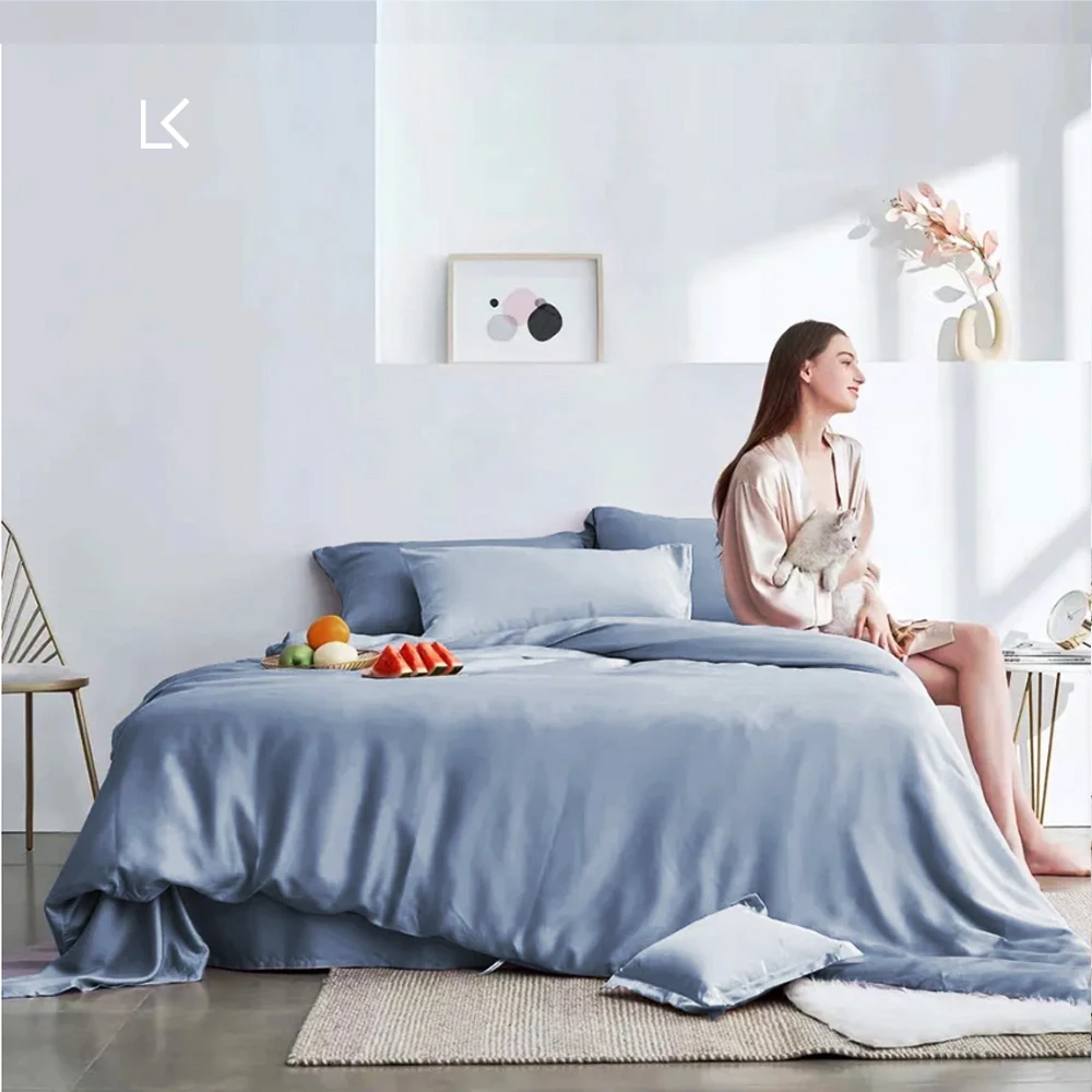
The natural properties of silk make best color silk bed sheets look significantly different in person compared to online photos. A champagne silk might shimmer with golden warmth in morning light yet transform to a cool silvery tone under evening lamps. Similarly, blue silk bedding can range from vibrant azure in direct sunlight to a mysterious deep navy in dimmer settings.
For this reason, viewing silk samples in your actual bedroom environment before purchasing is invaluable. The lighting in your specific space—whether primarily natural daylight, warm-toned lamps, or cool LED fixtures—will dramatically impact how colors appear on your bed.
The Psychology of Bedroom Colors: Choosing the Right Silk Bedding Mood
The colors you select for your silk bedding do more than please the eye—they actively shape the atmosphere and emotional impact of your bedroom. Different color families create distinct psychological effects that can transform your sleep sanctuary.
Calming & Serene Colors
Blues, greens, lavenders, and soft neutrals create a peaceful retreat atmosphere perfect for relaxation and restful sleep.
- Pale blue silk: Evokes clear skies and still waters, reducing stress and lowering blood pressure
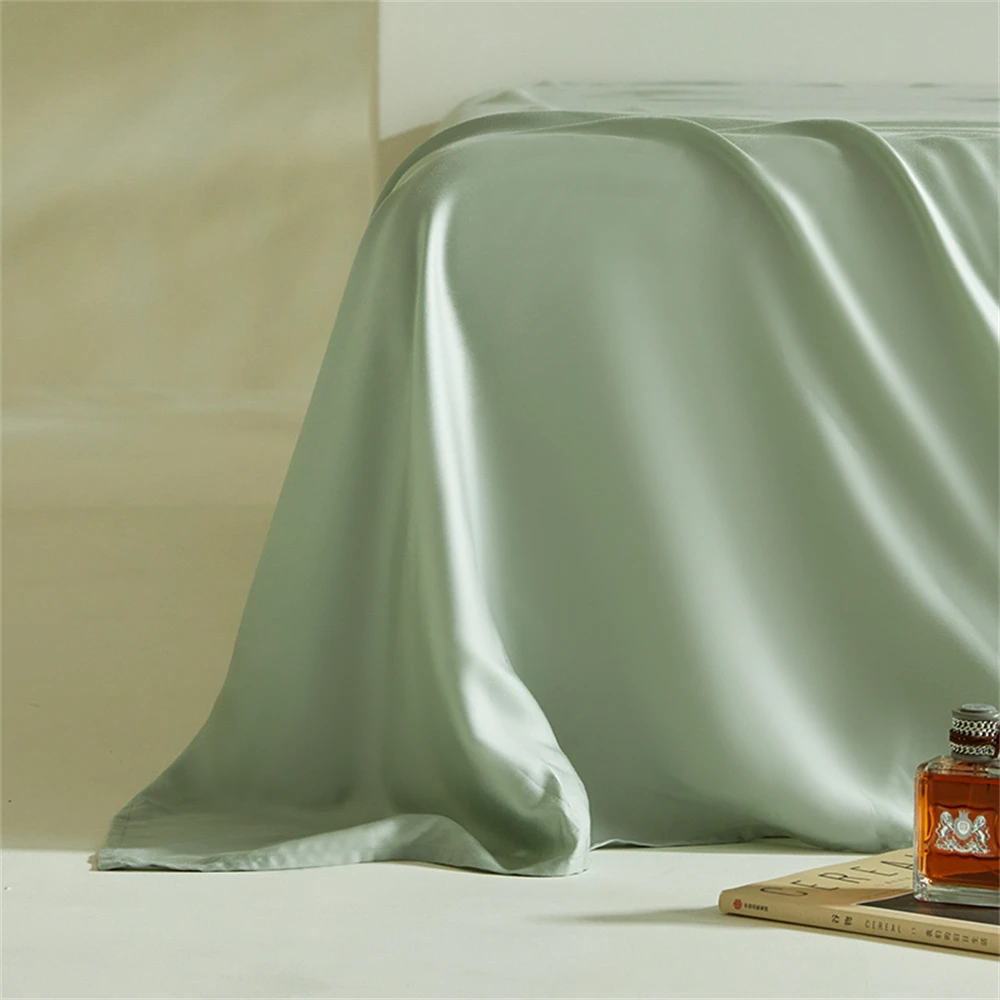
- Sage green: Connects to nature, creating a refreshing yet tranquil environment
- Lavender: Offers subtle color with calming properties similar to its botanical namesake
- Soft neutrals: Provide a clean, uncluttered feeling conducive to mental relaxation
Warm & Inviting Colors
Blush tones, creams, terracotta, and earthy neutrals make a bedroom feel like a cozy embrace.
- Blush pink: Creates a subtle warmth without overwhelming the space
- Cream and ivory: Offers warmth without the starkness of pure white
- Terracotta: Brings earthy richness reminiscent of Mediterranean aesthetics
- Warm neutrals: Establish a foundation of comfort and security
Energizing & Vibrant Colors
Jewel tones like emerald, sapphire, and ruby infuse spaces with energy and drama.
- Emerald green: Balances vibrancy with natural harmony
- Sapphire blue: Offers rich color depth with a cooling effect
- Ruby red: Creates passion and energy (best used as accents rather than main bedding)
- Gold tones: Add luxurious warmth and optimistic energy
Sophisticated & Elegant Colors
Grays, silvers, charcoals, and crisp whites project refined taste and timeless elegance.
- Silver gray: Creates a modern, sleek appearance with subtle luxury
- Charcoal: Delivers dramatic depth while remaining neutral
- Crisp white: Evokes hotel-like cleanliness and timeless sophistication
- Black: Ultimate statement of bold elegance (most impactful when balanced with lighter elements)
When selecting from our Mulberry silk bedding sets, consider not just what colors you like but what atmosphere you want to create. The perfect silk bedding color should align with both your aesthetic preferences and the emotional atmosphere you desire. Our guide to choosing perfect silk bedding colors can provide additional insights into creating your ideal bedroom atmosphere.
Color Harmony Principles for Creating a Cohesive Silk Bedding Design
Creating a beautifully cohesive bedroom starts with understanding basic color harmony principles. When applied to silk bedding, these principles take on special significance due to silk’s unique reflective properties.
Monochromatic Schemes
A monochromatic color scheme uses varying shades, tints, and tones of a single color family—creating subtle sophistication through nuance rather than contrast.
- Work with different intensities of the same color (light blue sheets with navy pillowcases)
- Incorporate texture variation to add visual interest within the color family
- Use silk’s natural sheen to create depth even within a single color
- Add white or black accents for definition within the monochromatic palette
With silk bedding, monochromatic schemes are particularly effective because silk’s dimensional shine creates natural variation even within a single color. A monochromatic silver bedroom appears much richer in silk than it would in matte fabrics.
Analogous Schemes
Analogous color schemes use colors that sit adjacent to each other on the color wheel, creating harmonious combinations with subtle variation.
- Pair neighboring colors like blue and purple or green and blue
- Keep one color dominant and use the second as an accent
- Consider using the third color in the analogous grouping as a subtle accent
- Balance cool analogous schemes (blues/greens) with warm elements elsewhere in the room
Silk bedding enhances analogous color schemes by emphasizing the subtle relationships between neighboring colors, making transitions appear even more graceful and sophisticated.
Complementary Schemes
Complementary colors sit opposite each other on the color wheel, creating high-energy contrast when used together.
- Balance complementary colors carefully, typically using one as the dominant color
- Consider muted versions of complementary colors for a more sophisticated look
- Use silk’s reflective quality to soften the potential harshness of complementary pairings
- Incorporate neutral elements to bridge between strong complementaries
With silk bedding, complementary schemes need careful handling—the fabric’s natural luminosity can intensify color relationships, making bold complementary pairs potentially overwhelming when used in equal amounts.
Neutral Foundations
Neutrals (white, cream, beige, gray) provide versatile foundations for any color scheme.
- Build a neutral silk foundation with sheets and duvet covers
- Add color through accent pillows or throws
- Use neutral silk bedding to showcase other bedroom elements like artwork or furniture
- Layer different neutral tones to create subtle sophistication
The inherent luster of silk elevates neutral palettes from basic to luxurious. A white cotton sheet might be simply white, but white silk contains hints of pearl, silver, and cream as light plays across its surface.
When designing your bedroom’s color scheme, explore different bedroom color schemes silk combinations to find the perfect balance between visual interest and restful harmony. Remember that silk’s unique properties can enhance and sometimes intensify color relationships, making even simple combinations appear remarkably sophisticated.
Working with Neutrals: The Foundation of Timeless Silk Bedding
Neutral silk bedding forms the cornerstone of timeless bedroom design, providing versatility that more colorful options simply cannot match. When crafted in luxurious silk, neutrals transcend the ordinary to become extraordinary statement pieces in their own right.
The Elegance of White Silk
White silk bedding offers unparalleled versatility while delivering a crisp, clean aesthetic that never goes out of style.
- Creates a hotel-inspired luxury look that feels perpetually fresh
- Reveals silk’s luminosity most dramatically, showcasing its natural pearl-like glow
- Serves as the perfect canvas for colorful accessories or statement pieces
- Visually expands smaller spaces, making bedrooms appear larger and airier
Our white silk sheets range from pure bright white to softer ivory tones, each offering distinct advantages. Pure white creates a clean, modern statement, while ivory and cream deliver warmth and subtle sophistication.
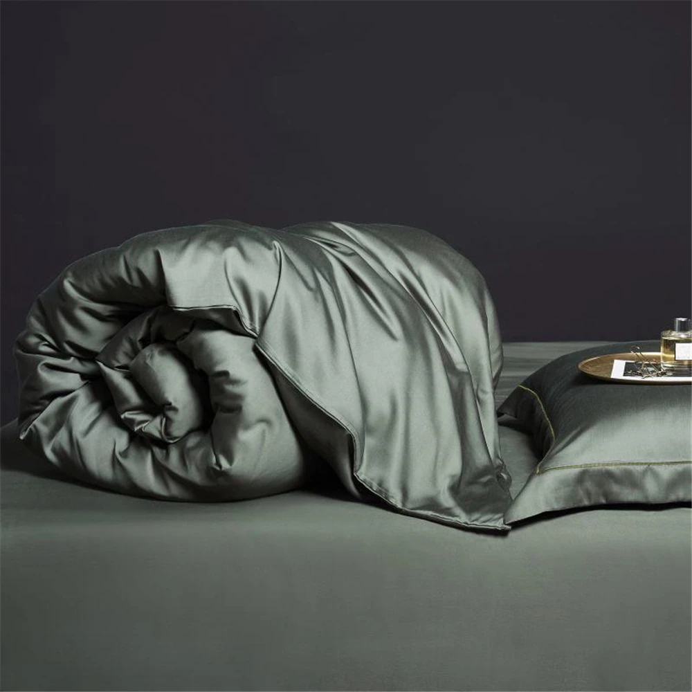
Sophisticated Grey Silk
Grey silk bedding spans a remarkable spectrum from barely-there silver to dramatic charcoal, each shade offering unique design possibilities.
- Light silver-grey creates an ethereal, cloud-like appearance that feels both modern and timeless
- Mid-tone greys provide practical versatility while maintaining sophistication
- Dark charcoal and slate greys establish dramatic focal points while remaining neutral
- Grey silk uniquely captures and reflects ambient colors, subtly changing appearance throughout the day
The grey silk sheets in our collection demonstrate how this chameleon-like neutral can anchor various design directions from minimalist modern to classic elegance.
The Warmth of Beige and Taupe
Beige silk transcends its humble reputation through silk’s transformative sheen, creating rich dimension.
- Creates a warm, grounding presence that feels naturally luxurious
- Complements both warm and cool color palettes with remarkable adaptability
- Showcases silk’s natural origins and organic luxury
- Provides practical longevity with forgiving coloration for everyday use
The Versatility of Neutrals
The magic of neutral silk bedding lies in its unmatched versatility:
- Allows seasonal color additions through accessories without changing core bedding
- Adapts effortlessly to changing design trends and preferences
- Coordinates seamlessly with existing furniture and decor
- Creates a sense of restful continuity while allowing other elements to shine
When investing in high-quality silk bedding, neutrals offer exceptional return on investment through their enduring appeal and design flexibility. They provide the perfect foundation for both minimalist spaces and more colorful, eclectic bedrooms.
Harmonizing Silk Bedding with Wall Colors
Creating harmony between your silk bedding and wall colors establishes the foundation for a cohesive bedroom design. The relationship between these two large color blocks determines the overall mood and visual flow of your space.
Silk Bedding with Neutral Walls
Neutral walls (white, beige, gray, greige) provide the most flexible backdrop for silk bedding colors.
- White walls: Create a clean canvas that works with virtually any silk bedding color—from bold jewel tones to subtle neutrals
- Beige walls: Add warmth that pairs beautifully with gold, champagne, and rose silk tones
- Gray walls: Establish a sophisticated backdrop for both cool tones (blues, silvers) and contrasting warm colors
- Greige walls: Bridge warm and cool palettes, working especially well with transitional colors like sage green or dusty blue silk
With neutral walls, you have freedom to choose silk bedding based on the mood you want to create rather than strict coordination rules. Bold silk colors will stand out as dramatic focal points, while complementary neutrals create subtle elegance.
Silk Bedding with Colored Walls
When working with colored walls, silk bedding selection requires more careful consideration.
- Blue walls: Pair with complementary neutral silk (white, cream, silver) or deepen the effect with analogous cool tones like lavender or teal
- Green walls: Balance with white, ivory or sand silk for freshness, or embrace natural themes with other earth tones
- Warm-colored walls (yellow, peach, terracotta): Counter with cooling silk tones like blue or silver, or amplify warmth with gold or champagne silk
- Deep-colored walls (navy, emerald, burgundy): Lighten with white or cream silk to provide necessary contrast and prevent the room from feeling too dark
The key principle is creating intentional relationships—either complementary contrast or harmonious extension—between your walls and silk bedding.
Silk Bedding with Patterned Walls
Wallpaper or textured wall treatments require special consideration when selecting silk bedding.
- Choose solid silk bedding that pulls a secondary color from the wallpaper pattern
- For busy patterns, select simple, solid silk colors that provide visual rest
- Consider the overall visual weight—ornate wallpaper pairs best with understated silk bedding
- Use silk’s natural sheen to add dimension without competing with wall patterns
The should bedding match wall color relationship isn’t about exact matching but about creating intentional harmony. Sometimes the most striking combinations come from thoughtful contrast rather than perfect coordination. With silk’s natural luminosity, even subtle color relationships between walls and bedding take on new depth and significance.
Coordinating Silk Bedding with Furniture and Wood Tones
The relationship between your silk bedding and bedroom furniture creates essential visual harmony in your space. Different wood tones and furniture styles interact with silk colors in unique ways that can either enhance or disrupt your bedroom’s overall aesthetic.
Light Wood Furniture
Blonde woods like maple, ash, birch, and light oak create airy, Scandinavian-inspired spaces that pair beautifully with specific silk bedding colors.
- Crisp whites and silvers enhance the modern, clean aesthetic of light woods
- Pale blues and greens create a fresh, nature-inspired palette
- Blush and light lavender add subtle warmth while maintaining the light, open feeling
- Black or navy silk creates dramatic contrast that highlights the furniture’s lightness
Light wood furniture generally favors silk bedding in cooler tones or equally light warm colors. The natural yellow undertones in many light woods balance beautifully with cool silk colors.
Dark Wood Furniture
Rich woods like walnut, mahogany, and dark oak bring traditional elegance and grounding weight to bedrooms.
- Ivory and champagne silk complement dark wood’s richness without competing
- Jewel tones like emerald, sapphire, and ruby extend the luxurious feeling
- White silk creates classic contrast that brightens the overall effect
- Gold and bronze tones enhance the warm undertones in dark wood
Dark wood furniture typically pairs well with either crisp contrasting silk (whites, creams) or equally rich, saturated colors that match its visual weight.
Painted Furniture
Painted furniture provides unique coordination opportunities with silk bedding.
- White furniture offers maximum flexibility with any silk color
- Black furniture creates sophisticated foundations for jewel tones or metallics
- Colored furniture works best when silk bedding provides complementary or analogous relationships
- Gray painted furniture serves as a neutral that works with most silk bedding colors
Upholstered Furniture
Beds with fabric headboards or bedroom seating require special consideration.
- Choose silk bedding that either complements or intentionally contrasts with upholstery
- Pull secondary colors from patterned upholstery into solid silk bedding
- Create textural contrast between matte upholstery and luminous silk
- Consider the visual hierarchy—if the upholstery is a statement, let silk bedding be more subdued
The customizing room look silk approach considers these furniture relationships as part of a cohesive whole. Rather than matching exactly, aim for thoughtful coordination that considers both color and visual weight, creating balance between your silk bedding and furniture pieces.
Integrating Silk Bedding with Flooring and Rugs
The vertical color story in your bedroom extends from floor to ceiling, with your silk bedding serving as the crucial middle layer. Creating thoughtful connections between your flooring, area rugs, and silk bedding establishes visual flow that makes the entire room feel cohesive.
Hardwood Floor Considerations
Different wood flooring tones create distinct foundations that influence silk bedding color selection:
- Light wood floors (maple, ash, pine): Create bright foundations that work beautifully with most silk colors—both cool tones (blues, silvers) and warm hues (gold, rose)
- Medium wood floors (oak, cherry): Offer versatile middle grounds that bridge warm and cool silk tones equally well
- Dark wood floors (walnut, mahogany): Establish dramatic bases that pair elegantly with lighter silk tones like ivory, silver, and champagne
The contrast level between your floors and silk bedding affects the overall feeling of your space—high contrast creates dynamic energy while similar tones create peaceful continuity.
Carpeted Room Strategies
Wall-to-wall carpeting presents unique considerations for silk bedding coordination:
- Neutral carpets (beige, gray, taupe) offer maximum flexibility with silk bedding colors
- Colored carpets require more careful silk bedding selection to prevent clashing
- Consider the carpet’s undertones—warm beige carpets pair differently with silk colors than cool gray carpets
- Use silk bedding to either complement or purposefully contrast with carpet color
The visual weight of carpet makes it a dominant bedroom element—your silk bedding should acknowledge this relationship rather than compete with it.
Working with Area Rugs
Area rugs provide transition zones between flooring and bedding:
- Use area rugs to bridge disparate colors between floors and silk bedding
- Pull accent colors from patterned rugs into solid silk bedding choices
- Balance bold statement rugs with more subdued silk bedding
- Consider the rug’s position—bedside rugs have different coordination needs than under-bed rugs
Creating thoughtful connections from floor to bed makes the entire space feel intentionally designed. When styling bedrooms silk bedding, consider how color travels visually upward from flooring through bedding to create a complete and harmonious color story.
Timeless Silk Bedding Color Combinations
Certain silk bedding color combinations have proven their staying power across changing design trends. These timeless pairings create enduring elegance that remains sophisticated year after year.
White & Ivory: Crisp, Clean Luxury
The pairing of pure white with soft ivory creates subtle dimension without obvious contrast.
- Layer white sheets with ivory duvet covers for gentle depth
- Add textural interest through different silk weaves within the same color family
- Use varied sheens (matte silk vs. high-luster) to create subtle visual interest
- Incorporate pleating, quilting, or jacquard patterns to enhance dimension
This combination works beautifully in any style bedroom, from traditional to ultra-modern, creating a foundation of quiet luxury that never feels trendy or dated.
Greys & Silvers: Modern Elegance
The spectrum from pale silver to deep charcoal offers sophisticated neutrality with contemporary appeal.
- Layer different grey tones to create visual depth (silver sheets with charcoal duvet)
- Add metallic silver accents through decorative pillows or throws
- Balance cool greys with warm woods or brass accents in the room
- Use light-catching silk to maximize the dimensional quality of grey tones
Grey silk bedding creates a modern foundation that pairs beautifully with virtually any accent color you might want to incorporate seasonally.
Champagne & Gold: Subtle Warmth
Warm metallics create luminous luxury that feels both timeless and inviting.
- Combine champagne sheets with deeper gold accent pillows
- Layer multiple warm neutrals (champagne, gold, bronze) for dimensional warmth
- Balance with cooler elements in the room to prevent overwhelming warmth
- Use silk’s natural sheen to enhance the precious metal quality of these tones
This combination creates a warm, glowing heart of the bedroom that feels both classically elegant and naturally welcoming.
Blue & White: Classic Pairing
From navy and white to pale blue and cream, blue-white combinations create enduring appeal.
- Use navy with white for crisp, tailored elegance
- Pair powder blue with cream for softer, more romantic feelings
- Layer different blue intensities against white for dimensional depth
- Consider blue as the grounding element with white as the predominant tone
This combination evokes both seaside freshness and sophisticated heritage, making it adaptable to numerous design styles.
Black & White: Bold Contrast
The ultimate high-contrast pairing creates dramatic impact with timeless sophistication.
- Use white as the dominant tone with black accents for open, airy contrast
- Create hotel-like luxury with primarily black bedding accented by white borders or pillows
- Add a third neutral (silver, taupe) to soften the starkness of pure black and white
- Leverage silk’s dimensional quality to soften the potentially harsh contrast
Our luxury silk bedding sets and guidance on matching silk duvet sheet sets provide elegant options for creating these timeless combinations in your own bedroom. With silk’s natural luminosity, even the most classic color pairings take on fresh life and dimension.

Trending Silk Bedding Color Combinations for Contemporary Bedrooms
While timeless combinations never fail, current interior design trends offer fresh silk bedding color pairings that feel particularly relevant to contemporary aesthetics. These modern combinations balance current style with lasting appeal.
Sage Green & Ivory: Natural Retreat
This nature-inspired pairing creates a peaceful sanctuary that connects to the growing biophilic design movement.
- Use soft sage green as the dominant tone with ivory accents
- Layer multiple green intensities for natural dimension
- Add natural wood elements to enhance the organic quality
- Incorporate botanical patterns in accent pieces to strengthen the nature connection
Our green silk sheets in sage tones create this tranquil, grounding effect while maintaining sophisticated elegance. The combination feels both fresh and timeless, connecting to nature without being overtly themed.
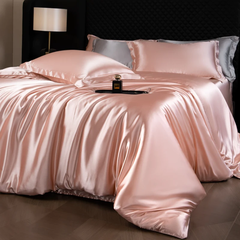
Blush Pink & Grey: Soft Femininity with Edge
This thoroughly modern pairing balances gentle warmth with contemporary coolness.
- Use grey as the foundation with blush accents for subtle femininity
- Alternatively, make blush the star with grey as the supporting neutral
- Add white elements for brightness and clarity
- Incorporate metallic accents (silver, rose gold) to enhance sophistication
Our pink silk sheets in blush tones create this perfect balance of softness and structure when paired with varied grey elements. The combination feels distinctly contemporary while remaining elegantly wearable.
Terracotta & Cream: Warm Earth
Inspired by global design influences, this warm-toned pairing creates rich, earthy comfort.
- Use cream as the foundation with terracotta accents
- Add texture through varied silk weaves to enhance the organic quality
- Incorporate natural materials (wood, stone) throughout the room to strengthen the earth connection
- Balance with cooling elements to prevent overwhelming warmth
This combination offers sophisticated coziness that feels both current and connected to timeless natural elements.
Navy & Gold: Rich Luxury
This pairing creates dramatic luxury with a contemporary edge.
- Use navy as the grounding element with gold as brilliant accent
- Balance the visual weight—a little gold goes a long way against navy
- Add white or cream elements to lighten the overall effect
- Consider texture variations to enhance the luxurious quality
The contrast between deep navy and luminous gold creates a striking contemporary statement with roots in classic design traditions.
Lavender & Silver: Subtle Color
This sophisticated combination offers gentle color with elegant restraint.
- Use silver as the primary tone with lavender accents
- Layer multiple lavender intensities for dimensional depth
- Balance with warming elements to prevent an overly cool effect
- Consider adding deeper purple accents for grounding depth
This combination creates a contemporary bedroom with distinctive character that still feels serene and restful.
Our comprehensive silk bedding color options guide provides additional information on current color trends and how to incorporate them into your bedroom design for contemporary yet enduring style.
Seasonal Adaptations for Your Silk Bedding Palette
One of silk bedding’s greatest advantages is its natural temperature regulation, making it appropriate year-round while still allowing for seasonal color shifts that refresh your space and align with changing weather.
Spring/Summer: Light and Refreshing
Warmer months call for colors that feel light, cool, and airy.
- Shift to cooler tones like pale blue, mint green, and lavender
- Embrace lighter versions of favorite colors (sky blue instead of navy)
- Incorporate crisp whites for clean, fresh summer feeling
- Consider pastel accents that echo seasonal blooms
Practical adaptations might include:
– Folding heavier duvets to the foot of the bed
– Showcasing just sheets and lightweight coverlets
– Adding seasonal throw pillows in summer-specific colors
– Using sheerer silk weaves that enhance the light, airy feeling
Fall/Winter: Rich and Cocooning
Cooler months benefit from colors that create visual warmth and coziness.
- Transition to deeper jewel tones like emerald, sapphire, and burgundy
- Embrace rich neutrals like chocolate, camel, and deep charcoal
- Layer multiple warm tones for dimensional coziness
- Add metallic accents that catch and amplify limited winter light
Practical adaptations might include:
– Adding quilted silk coverlets for layered warmth
– Incorporating additional decorative pillows for plushness
– Using heavier silk weaves with more substantial drape
– Layering multiple silk pieces for both physical and visual warmth
Cost-Effective Seasonal Transitions
You don’t need to replace all bedding to create seasonal shifts:
- Maintain neutral foundation pieces (sheets, duvet covers) year-round
- Change only pillowcases and decorative elements seasonally
- Use dual-sided duvet covers with seasonal options on each side
- Layer seasonal throws that can be easily changed
The seasonal uses silk bedding approach allows you to maintain the core benefits of silk while still acknowledging seasonal shifts in color preferences and practical needs. Silk’s natural temperature regulation makes it uniquely suited to year-round use, while thoughtful color adaptations keep your space feeling fresh and appropriate regardless of season.
Layering Different Silk Colors for Visual Depth
Creating a truly luxurious bed involves thoughtful layering of colors, textures, and silk bedding elements. This dimensional approach elevates your bedroom from simple to sophisticated through careful combinations.
Sheet, Duvet, and Throw Combinations
The foundation of silk bedding layering begins with the core components:
- Start with sheets as your base layer, setting the color foundation
- Add duvet covers or comforters as your middle layer, either complementing or contrasting with sheets
- Top with decorative throws or coverlets that add accent color and texture
- Consider the visibility of each element—sheets will show at fold-overs, pillowcases prominently display
Successful combinations include:
– White sheets with navy duvet and silver throw (classic with depth)
– Grey sheets with blush duvet and ivory throw (contemporary softness)
– Ivory sheets with sage green duvet and cream throw (natural harmony)
Pillow Arrangements with Multiple Colors
Pillows create the most visible color story on your bed:
- Start with sleeping pillows in colors that match or complement sheets
- Add shams in colors that connect to your duvet cover
- Layer decorative pillows in accent colors that pull the combination together
- Create a gradient effect by arranging pillows from lightest to darkest
Effective pillow color combinations include:
– White, silver, and charcoal (monochromatic sophistication)
– Ivory, gold, and terracotta (warm dimensional glow)
– White, pale blue, and navy (classic depth)
Tone-on-Tone Layering
Creating subtle sophistication through variations within a color family:
- Select different intensities of the same color (light blue, medium blue, navy)
- Incorporate different finishes (matte silk, high-gloss silk) within the same color
- Use textural differences to create visual distinction within similar colors
- Consider the light-catching properties of silk to enhance subtle differences
Layering silk sheets duvets creates visual interest even when using similar colors. The natural variation in how silk catches light means that even pieces in very similar colors will show beautiful dimensional differences as light changes throughout the day.
When how coordinate silk sheet colors, remember that the goal isn’t perfect matching but intentional relationship. Whether you choose high-contrast combinations or subtle tone-on-tone approaches, the thoughtful relationship between colors creates the sophisticated impact.

Incorporating Patterns with Solid Silk Bedding
While solid-colored silk bedding offers timeless elegance, thoughtfully incorporated patterns add dimension and personality to your bedroom. The key is creating balanced relationships between solid silk elements and patterned companions.
Solid Silk with Patterned Accents
Solid silk bedding provides the perfect foundation for patterned accents:
- Use patterned decorative pillows against solid silk duvet covers
- Add patterned throws across solid silk bedding for focused visual interest
- Incorporate patterned bed skirts or headboard upholstery with solid silk bedding
- Balance pattern scale with room size—larger rooms can handle larger patterns
The visual weight of patterns should be proportional to the solid silk elements—smaller pattern accents for dominant silk pieces, more substantial patterns when silk is more minimal.
Combining Textured Silk with Printed Elements
Silk’s natural textural possibilities create subtle pattern even in solid colors:
- Pair jacquard silk (with self-pattern) with geometric printed accents
- Use quilted silk bedding with floral or botanical printed elements
- Combine pleated silk with striped or linear patterns
- Layer silk charmeuse (high sheen) with matte printed fabrics for textural contrast
This textural contrast creates sophisticated depth without overwhelming the space with competing patterns.
Creating Subtle Pattern Through Different Silk Weaves
Silk itself offers pattern possibilities through varied construction:
- Combine silk charmeuse (smooth, high sheen) with silk habotai (crisp, lighter weight)
- Layer silk satin with raw silk for dramatic textural contrast
- Use silk damask for subtle self-pattern that changes with light reflection
- Incorporate silk dupioni with its characteristic slubbed texture for natural variation
Our silk pillowcases collection offers various options for adding both color and textural interest to solid bedding foundations. The subtle interplay between different silk textures creates sophisticated pattern through light and shadow rather than printed designs.

100% Silk Sheets, Green Silk Sheets, King Size Silk Bedding Set, Mulberry Silk Bedding Sets, Queen Size Silk Bedding Set
Price range: $1,246.21 through $1,615.22 Select options This product has multiple variants. The options may be chosen on the product page
Pink Silk Sheets, Twin Size Silk Sheets
$171.80 Select options This product has multiple variants. The options may be chosen on the product page
Full-size Silk Sheets, Pink Silk Sheets
$136.31 Select options This product has multiple variants. The options may be chosen on the product page
Grey Silk Sheets, Silk Sheet and Pillowcase Set
Price range: $88.20 through $146.64 Select options This product has multiple variants. The options may be chosen on the product page
100% Silk Sheets, King Size Silk Bedding Set, Mulberry Silk Bedding Sets, Queen Size Silk Bedding Set, White Silk Sheets
Price range: $1,000.79 through $1,351.42 Select options This product has multiple variants. The options may be chosen on the product page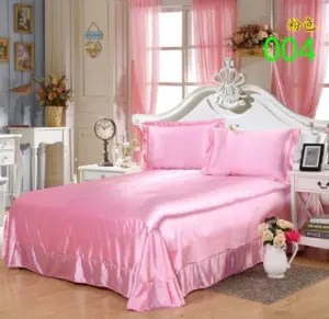

King Size Silk Sheets, Pink Silk Sheets, Silk Flat Sheets
$132.96 Select options This product has multiple variants. The options may be chosen on the product page
Practical Considerations for Choosing Silk Bedding Colors
Beyond pure aesthetics, practical factors should inform your silk bedding color choices to ensure lasting satisfaction with your investment.
Room Size and Light Considerations
The dimensions and natural light in your bedroom significantly impact color perception:
- Smaller rooms generally benefit from lighter silk colors that visually expand the space
- Darker colors can make spacious rooms feel more intimate and cozy
- North-facing rooms with cooler light may need warming silk tones to balance the bluish natural light
- South-facing rooms with warm golden light can handle cooler silk colors that balance the warmth
Consider how your specific room’s light changes throughout the day and seasons—colors that look perfect in morning light might appear drastically different in evening lamp light.
Durability and Maintenance Factors
Different silk colors show wear and require different care considerations:
- Very light colors (white, cream) show soil more readily but can be more thoroughly cleaned
- Very dark colors (navy, black) show dust and lint more prominently
- Mid-tone colors (blues, greens, grays) often provide the best balance of soil-hiding and lint-concealing properties
- Consider your lifestyle—households with children, pets, or frequent breakfast-in-bed habits might prefer more forgiving colors
Color Fastness and Fading
Silk’s relationship with light affects color longevity:
- All silk colors will gradually fade with sun exposure, but some colors show this more quickly
- Reds, purples, and blues typically show fading more noticeably than neutrals
- Position beds away from direct sunlight when possible to preserve color vibrancy
- Consider room orientation and window treatments when selecting more fade-sensitive colors
The Importance of Swatches
Never purchase silk bedding without seeing actual fabric samples in your space:
- Request swatches of several color options before making final decisions
- View swatches both during day and evening hours to see how light affects appearance
- Place swatches against existing bedroom elements to confirm harmonious relationships
- Remember that larger pieces will create a more intense color impact than small swatches
The popular color choices silk bed linens often balance both aesthetic appeal and practical considerations. For comprehensive guidance on all aspects of selection and care, our full guide silk bedding provides valuable insights beyond just color considerations.
How to Care for Colored Silk Bedding
Proper care ensures that your silk bedding colors remain vibrant and beautiful for years to come. Different colors require slightly different maintenance approaches to preserve their original beauty.
Essential Care Tips for All Colored Silk
- Wash in cool water (30°C/86°F or cooler) using pH-neutral detergents specifically formulated for silk
- Turn items inside out before washing to minimize friction on the color-bearing surface
- Avoid direct sunlight when drying—hang in shade or lay flat to dry
- Iron on low heat from the reverse side if necessary, using a pressing cloth
- Store away from direct sunlight in breathable cotton bags rather than plastic
Special Considerations for Dark Colors
Darker silk colors require particular attention to preserve their richness:
- Use detergents specifically formulated for dark colors
- Add a tablespoon of white vinegar to the rinse water to maintain color vibrancy
- Minimize washing frequency when possible—air out between uses
- Be particularly cautious about friction, which can cause dark colors to fade in high-contact areas
Special Considerations for Light Colors
Lighter silk colors present different care challenges:
- Address stains immediately—the longer they set, the more difficult removal becomes
- Consider occasional gentle whitening treatments specifically formulated for silk for white bedding
- Be vigilant about keeping body oils and cosmetic products away from light-colored silk
- Separate storage from other items that might transfer color
With proper care, silk bedding in any color can maintain its beauty for many years, making it a worthwhile investment in both quality and aesthetics.
Frequently Asked Questions About Silk Bedding Colors
What colors go well with grey silk bedding?
Grey silk provides a sophisticated neutral foundation that pairs beautifully with many colors. For a contemporary look, combine grey silk with blush pink, sage green, or pale lavender accents. For more dramatic contrast, pair grey silk with mustard yellow, deep teal, or burgundy elements. White and cream always create classic combinations with grey, while metallics like silver and gold add luxurious dimension.
Can I mix different colors of silk bedding?
Absolutely! Mixing silk colors creates visual interest and depth. The key is creating intentional relationships rather than random combinations. Consider color theory principles—monochromatic schemes (different shades of blue), analogous colors (blue with purple), or complementary colors (blue with orange accents). Start with a dominant base color and add secondary colors in decreasing amounts for balanced compositions.
How do I make my silk bedding look luxurious?
Layering is the secret to luxurious-looking silk bedding. Start with high-quality foundation pieces and add multiple pillows in varying sizes and complementary colors. Incorporate different silk textures (charmeuse, habotai, damask) for dimensional interest. Ensure bedding is wrinkle-free and properly pressed. Add thoughtful details like decorative pillows with special treatments (pleating, embroidery) and ensure proportions are generous—slightly oversized duvets and abundant pillows create a sense of opulence.
Should my silk sheets match my duvet cover exactly?
Exact matching often creates a flat, less interesting appearance. Instead, aim for coordinating colors that create intentional relationships. Consider tone-on-tone approaches (light blue sheets with navy duvet), complementary colors (ivory sheets with champagne duvet), or deliberate contrast (white sheets with colored duvet). The goal is harmonious relationship rather than perfect matching.
What is the most popular color for silk sheets?
White, ivory, and grey silk sheets consistently rank as bestsellers due to their versatility and timeless appeal. White silk offers crisp luxury, ivory provides warm sophistication, and grey delivers contemporary elegance. Among actual colors, blush pink, sage green, and sky blue have gained significant popularity in recent years for their ability to add subtle color while remaining versatile enough to work with changing bedroom decor.
Does silk color fade over time?
All silk colors will gradually fade with exposure to sunlight and regular washing, though high-quality silk with proper dye processes resists fading better than lower-quality options. Darker and more vibrant colors typically show fading more noticeably than neutrals. To minimize fading, keep silk bedding out of direct sunlight, follow proper washing instructions, and use pH-neutral detergents specifically formulated for silk.
For more detailed information about selecting the perfect colors for your bedroom, explore our guide to choosing perfect silk bed linen colors which addresses these questions and many more.