

Introduction: The Psychology and Art of Bedding Color Coordination
Your bedroom is more than just a place to sleep—it’s your personal sanctuary, a retreat from the world where color plays a pivotal role in creating the perfect atmosphere. The colors you choose for your bedding significantly impact both your bedroom’s aesthetic appeal and your emotional well-being.
Color coordination in bedding isn’t merely decorative; it’s deeply psychological. Studies show that certain hues can dramatically influence sleep quality and mood—blues and greens promote calmness and relaxation, while reds and oranges can energize a space. This connection between color and emotion explains why luxury hotels meticulously design their bedding color schemes to enhance guest experience and create memorable environments.
Creating a harmonious bedroom starts with understanding how color affects perception and feeling. The right color combinations can make a small room feel spacious, a dark room feel brighter, or a sterile room feel cozy. The amazing benefits of Mulberry silk sheets extend beyond comfort to how they interact with light and color, adding a dimension of luxury that enhances any color scheme.
Throughout this guide, we’ll explore essential color theory, layering techniques, and room integration strategies to help you transform your bedroom into the sanctuary you deserve.
Understanding Color Theory for Bedding Selection
Before diving into specific combinations, understanding basic color theory provides the foundation for successful bedding coordination. The color wheel is your best friend when selecting bedding colors that work harmoniously together.
Color Wheel Basics for Bedding
- Primary Colors: Red, blue, and yellow form the foundation of all other colors
- Secondary Colors: Green, orange, and purple created by mixing primaries
- Tertiary Colors: The in-between shades that offer subtle variations
Warm vs. Cool Colors
Warm colors (reds, oranges, yellows) tend to energize a space, making them perfect for bedrooms that need vibrancy. Cool colors (blues, greens, purples) create calm and relaxation—ideal for sleep sanctuaries. The quality of your bedding material enhances these effects, which is one reason why many choose Mulberry silk sheets for their superior color depth and natural luster.
Key Bedding Color Schemes
- Monochromatic: Various shades and tints of a single color create a sophisticated, cohesive look. For example, layers of cream, ivory, and white create a serene, luxurious bedroom.
- Analogous: Colors adjacent on the wheel blend naturally—soft blue sheets with sage green pillows and teal accents create gentle harmony.
- Complementary: Opposite colors on the wheel create dramatic contrast—navy bedding with copper or gold accents makes a bold statement.
- Neutral Foundation: Whites, grays, taupes, and beiges serve as versatile foundations that can be paired with almost any accent color.
Premium materials like silk showcase subtle color variations particularly well due to their natural sheen and the way they catch light. When choosing perfect silk bedding colors, remember that silk’s natural luminosity will make colors appear richer and more dimensional than the same shade in cotton or polyester.
Essential Bedding Layering Techniques: Building Your Color Story
Creating a beautifully coordinated bed involves thoughtful layering, with each element contributing to the overall color story. Think of your bed as a canvas where layers build depth and interest.
Base Layer: Foundation Colors
Start with sheets as your foundation. These can either:
* Match your main bedding color for a cohesive look
* Provide subtle contrast as a complementary or analogous color
* Add an unexpected pop when covers are turned down
High-quality sheet materials, particularly silk, establish the tone for your entire bed. Their close contact with your skin makes both color and texture especially important here.
Main Statement Piece: Dominant Color
Your duvet cover or comforter serves as the dominant visual element, covering the largest surface area. This piece should:
* Establish the main color theme
* Connect with your overall room design
* Reflect the mood you want to create (calming, energizing, romantic)
Mid-Layers: Color Variation
Pillowcases, shams, and quilts add complexity to your color scheme:
* Standard pillowcases can match sheets for cohesion
* Decorative shams can complement or contrast with the main bedding
* A folded quilt or blanket at the foot of the bed can introduce an additional coordinating color
For more sophisticated combinations, explore guides on silk bedding combinations that offer pre-selected color pairings designed to work perfectly together.
Finishing Touches: Accent Colors
Throw pillows and blankets provide the final color accents:
* Use these pieces to introduce bolder colors or patterns
* Limit accent colors to 1-2 for a curated look
* Consider using these items to pull in colors from elsewhere in the room
When layering colors, quality materials elevate the entire look. Mulberry silk’s natural luster adds remarkable depth to colors compared to synthetic materials, creating a multi-dimensional effect even within a simple color scheme.
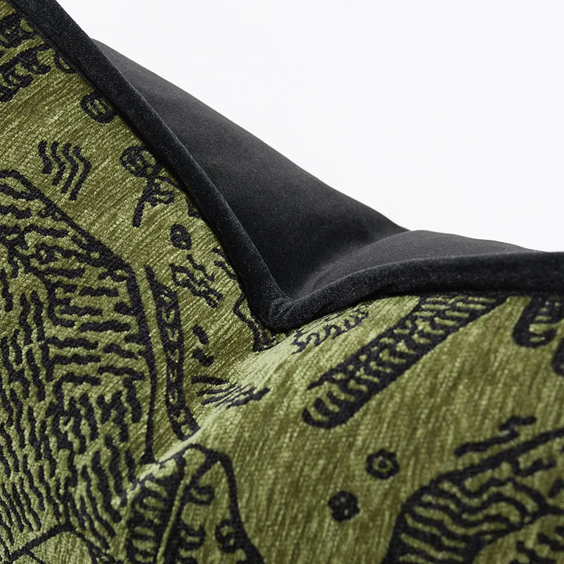
Incorporating Patterns and Textures: Adding Visual Depth
Patterns and textures transform a flat color scheme into a rich, multi-dimensional experience. The key is balancing these elements so they enhance rather than overwhelm your bedding design.
The Rule of Three for Pattern Mixing
When incorporating patterns, follow the “Rule of Three” for balanced variety:
* Large-scale pattern (like an oversized floral on a duvet)
* Medium-scale pattern (such as a geometric design on Euro shams)
* Small-scale pattern (perhaps a subtle stripe on standard pillowcases)
The unifying factor should be your color palette—each pattern should share at least one common color to maintain cohesion.
Texture Creates Interest Within Color Limitations
Even within a monochromatic or limited color scheme, texture creates visual depth:
* Smooth silk pillowcases against a quilted cotton coverlet
* Chunky knit throws against crisp percale sheets
* Velvet pillows against linen duvet covers
Silk bedding is particularly effective for adding textural contrast. The complete guide to Mulberry silk bed sheets explores how silk’s unique texture captures and reflects light differently throughout the day, creating subtle color variations even within a single hue.
Balancing Bold and Neutral
When incorporating bold patterns or textures:
* Anchor them with solid-colored pieces
* Keep the color palette consistent throughout
* Let one statement piece take center stage while others play supporting roles
Remember that texture can be subtle or pronounced—the gentle sheen of silk provides a different textural element than the raised pattern of a jacquard weave, yet both add sophisticated depth to your bedding ensemble.
Harmonizing Bedding with Room Elements: Creating a Unified Space
Your bedding doesn’t exist in isolation—it’s part of your bedroom’s overall design scheme. Creating harmony between your bedding colors and the room’s elements elevates the entire space.
Coordinating with Wall Colors
The relationship between bedding and wall color sets the foundation for your room’s color harmony:
* For bold wall colors, consider more neutral bedding with accents that pick up the wall tone
* For neutral walls, bedding can be either a continuation of that neutrality or a beautiful contrast
* Consider the finish of your paint—flat, eggshell, and glossy finishes reflect light differently, affecting color perception
Many wonder whether bedding should match wall color exactly. Generally, exact matching can feel flat, while complementary or coordinating colors create more visual interest.
Working with Natural Light
The amount and quality of natural light dramatically affects how bedding colors appear:
* North-facing rooms receive cooler light—warmer bedding colors can balance this effect
* South-facing rooms get warm, direct sunlight—cooler bedding tones can create balance
* East/west-facing rooms change dramatically throughout the day—neutral bedding with changeable accents works well
Silk bedding responds beautifully to changing light conditions, with colors appearing to shift subtly throughout the day due to the fabric’s natural reflective properties.
Pulling from Existing Room Elements
Create cohesion by connecting bedding colors to other room elements:
* Extract accent colors from artwork, rugs, or decorative objects
* Echo furniture wood tones in bedding textures or complementary colors
* Consider the metal finishes in your room (brass, chrome, etc.) when selecting bedding with subtle sheen
For complete bedroom transformations, explore luxury silk bedding sets that can be coordinated with various room styles and existing decor elements.
Room Size Considerations
Color coordination strategies should take your bedroom’s dimensions into account:
* Smaller rooms often benefit from lighter bedding colors to create a sense of space
* Larger rooms can handle darker or bolder bedding colors without feeling cramped
* Visual weight matters—heavy patterns and dark colors can make spaces feel smaller
Inspiring Bedding Color Palettes for Every Style
Finding the perfect color scheme often starts with inspiration. Here are distinctive bedding palettes to spark your creativity, each creating a unique bedroom atmosphere.

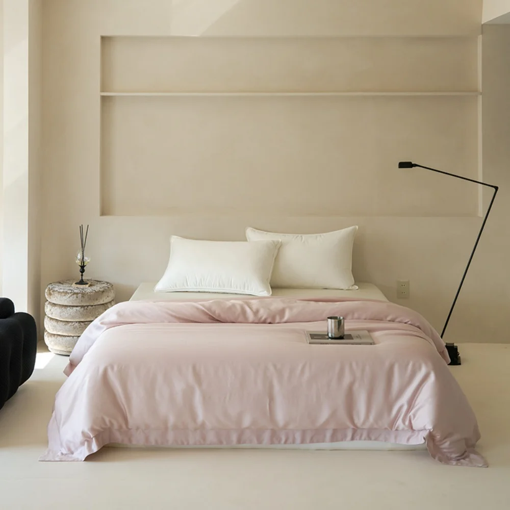
Serene Retreat
Create a peaceful sanctuary with cool, calming tones:
* Foundation: Powder blue or ice blue sheets
* Main layer: Cloud white or light gray duvet cover
* Accents: Silver-blue pillows, pale lavender throw
* Perfect for: Light sleepers seeking a peaceful environment
This palette works beautifully with natural light and makes smaller bedrooms appear more spacious and airy.
Warm & Earthy
Embrace nature-inspired tones for grounding comfort:
* Foundation: Cream or oatmeal sheets
* Main layer: Terracotta or warm sienna duvet cover
* Accents: Sage green pillows, cognac leather or rust throw
* Perfect for: Creating cozy, welcoming spaces
This palette pairs wonderfully with wooden furniture and natural elements like plants or stone.
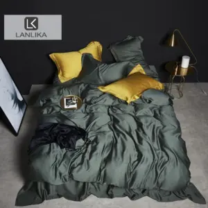
Bold & Dramatic
Make a statement with rich, saturated colors:
* Foundation: Charcoal or black sheets
* Main layer: Emerald green, sapphire blue, or burgundy duvet cover
* Accents: Gold or copper pillows and throws
* Perfect for: Design-forward bedrooms that serve as visual focal points
This approach works best in well-lit rooms that can handle the visual weight of deeper colors.
Crisp & Contemporary
Create a clean, modern aesthetic:
* Foundation: Pure white sheets
* Main layer: Light gray or greige duvet cover
* Accents: Charcoal pillows, single bold-colored throw in azure or coral
* Perfect for: Minimalist aesthetics and small spaces
This versatile palette provides the perfect backdrop for seasonal accessories and can be easily refreshed.
Whimsical & Eclectic
Express personality with playful combinations:
* Foundation: White or cream sheets
* Main layer: Dusty rose or mustard yellow duvet cover
* Accents: Mix of complementary patterns and colors in teal, coral, or plum
* Perfect for: Creative spirits who enjoy changing their space regularly
Browse our collection of silk bedding sets to find pieces that can help you achieve these inspired looks with the added luxury of premium materials.

100% Silk Sheets, Green Silk Sheets, King Size Silk Bedding Set, Mulberry Silk Bedding Sets, Queen Size Silk Bedding Set
Price range: $1,246.21 through $1,615.22 Select options This product has multiple variants. The options may be chosen on the product page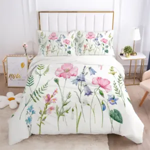
Full Silk Bedding Set, King Size Silk Bedding Set
Price range: $120.99 through $190.49 Select options This product has multiple variants. The options may be chosen on the product page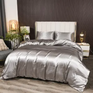
Grey Silk Sheets, Silk Sheet and Pillowcase Set
Price range: $88.20 through $146.64 Select options This product has multiple variants. The options may be chosen on the product page
100% Silk Sheets, King Size Silk Bedding Set, Mulberry Silk Bedding Sets, Queen Size Silk Bedding Set, White Silk Sheets
Price range: $1,000.79 through $1,351.42 Select options This product has multiple variants. The options may be chosen on the product page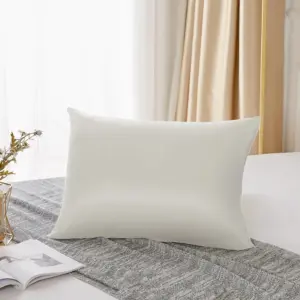
King Size Silk Pillowcases, Mulberry Silk Pillowcases, Queen Size Silk Pillowcases
Price range: $94.96 through $121.56 Select options This product has multiple variants. The options may be chosen on the product page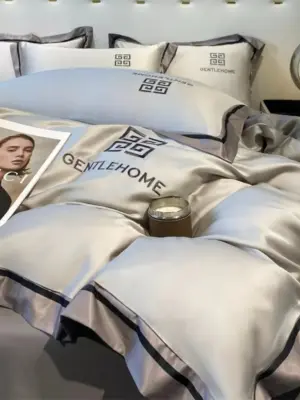

100% Silk Sheets, Queen Size Silk Fitted Sheet, Queen Size Silk Pillowcases, Queen Size Silk Sheets
Price range: $259.05 through $284.13 Select options This product has multiple variants. The options may be chosen on the product page
Expert Strategies for Flawless Bedding Coordination
Elevate your bedding coordination with these professional designer strategies that ensure polished, cohesive results.
1. Start with an Anchor Piece
Build your color scheme around one special item:
* Choose a patterned duvet, special pillow, or artwork you love
* Extract 3-4 colors from this piece to create your palette
* Use these colors in varying proportions throughout your bedding
This approach ensures harmony and gives your bedding design a purposeful foundation.
2. Create Intentional Contrast
Professional designers know that perfect contrast creates visual interest:
* Pair light with dark (white sheets with navy duvet)
* Combine matte and shiny textures (linen with silk)
* Mix solid colors with subtle patterns that share a color family
3. Apply the 60-30-10 Rule
This designer principle creates perfect balance:
* 60% dominant color (usually the duvet/comforter)
* 30% secondary color (sheets, standard pillowcases)
* 10% accent color (decorative pillows, throws)
This distribution creates visual harmony while allowing for creative expression.
4. Test Colors in Your Specific Lighting
Colors appear dramatically different under various lighting conditions:
* Bring fabric samples or swatches home before purchasing
* Check colors in both morning and evening light
* Consider how seasonal light changes might affect perception
For more inspiration on perfect color combinations, explore our collection of beautiful bedding color combinations tested in various lighting environments.
5. Invest in Versatile Neutral Foundations
Build a flexible bedding wardrobe:
* High-quality white, cream, or gray sheets and duvet covers as bases
* Add seasonal color through less expensive pillows and throws
* Rotate accent pieces while maintaining your core bedding investment
6. Maintain Visual Balance
Consider the visual weight of colors and patterns:
* Balance bold elements with calming spaces
* Create symmetry with color placement (matching pillows on either side)
* Consider the bed from all viewing angles in the room
Common Bedding Color Coordination Mistakes to Avoid
Even with a good understanding of color principles, certain pitfalls can undermine your bedding design. Here are common mistakes and their solutions:
Overloading with Too Many Colors
Problem: Using more than 3-4 colors creates visual chaos and loses cohesion.
Solution: Limit your palette to a primary color, a complementary or analogous color, and 1-2 accent colors. This constraint actually enhances creativity while maintaining harmony.
Ignoring the Room’s Existing Palette
Problem: Bedding that clashes with walls, flooring, or furniture feels disconnected.
Solution: Before selecting bedding, identify the fixed elements in your room and choose bedding colors that either complement or intentionally contrast with these elements.
Under-utilizing Texture for Visual Interest
Problem: Focusing only on color can result in a flat, uninteresting bed.
Solution: Mix textures even within the same color family—pair silky pillowcases with a quilted duvet or a knit throw with woven sheets. Our Mulberry silk bedding sets offer exceptional texture that maintains color integrity over time.
Being Too Literal with Color Matching
Problem: Trying to match colors exactly often results in a contrived, unnatural look.
Solution: Aim for coordination rather than matching—variations within a color family create depth and sophistication.
Neglecting Lighting Impact
Problem: Colors chosen in store lighting often look different in home environments.
Solution: Test swatches in your actual bedroom at different times of day before committing to a full bedding set.
Choosing Impractical Colors
Problem: Very light colors in homes with pets or children, or trendy colors that you’ll quickly tire of.
Solution: Reserve trendy colors for easily changeable accents and invest in quality foundation pieces in timeless hues.
Frequently Asked Questions About Bedding Color Coordination
Can I mix patterns in bedding if they have different colors?
Yes, patterns can mix successfully if they share at least one color from your overall palette. Follow the scale rule: combine large, medium, and small patterns while maintaining a consistent color theme. For example, a large floral duvet can work with striped pillows if both contain the same shade of blue.
How do I choose bedding colors for a shared bedroom with different preferences?
Start with neutral white silk sheets as your foundation, then incorporate both parties’ preferred colors through pillows and accessories. Neutrals like gray, taupe, or navy can often serve as compromise colors that satisfy different tastes while maintaining a cohesive look.
Should my bedding match my curtains exactly?
Matching exactly often feels staged rather than stylish. Instead, aim for coordination—your curtains and bedding should complement each other through shared color families or contrasting in a purposeful way. If your curtains are patterned, pull one color from that pattern for your bedding.
How often should I update my bedding colors?
Core bedding pieces in quality materials and timeless colors can last for years. Consider seasonal refreshes with different accent pillows, throws, or silk pillowcases to keep your bedroom feeling current without replacing everything.
Creating Seasonal Transitions with Your Bedding Colors
Your bedding can evolve with the seasons without requiring a complete overhaul each time the weather changes. Smart seasonal transitions save money while keeping your bedroom fresh and appropriate year-round.
Core Year-Round Pieces
Invest in quality neutral bedding that works across seasons:
* White, cream, or gray duvet covers and sheet sets
* Simple patterns in timeless colors
* High-quality materials like silk that regulate temperature in both summer and winter
Seasonal Accent Swaps
Change these elements to reflect the season:
* Winter: Add deep burgundy, forest green, or navy pillows and throws
* Spring: Introduce soft pastels like blush, mint, or sky blue
* Summer: Brighten with coral, turquoise, or sunny yellow accents
* Fall: Warm up with amber, terracotta, or olive green details
The beauty of this approach is that simple changes like swapping silk pillowcases or throw blankets can completely transform the feeling of your room without replacing major bedding elements.
Maintaining Color Cohesion Year-Round
Keep your seasonal transitions elegant by:
* Maintaining one or two consistent colors throughout the year
* Choosing seasonal colors that complement your fixed room elements
* Storing off-season items properly to preserve their quality
With thoughtful color coordination, your bedroom becomes more than just a place to sleep—it transforms into a true sanctuary that adapts to your needs, reflects your personality, and enhances your well-being throughout the changing seasons.