
Introduction: The Art of Harmonious Silk Bedding
Silk bedding represents the pinnacle of bedroom luxury, with its unmistakable sheen, buttery-smooth texture, and natural temperature-regulating properties. Yet, beyond these practical benefits, the colors you select for your silk sheets play a crucial role in transforming your bedroom into a true sanctuary. Unlike cotton or polyester, silk interacts with light in a distinctive way, reflecting it to create a subtle luminosity that makes colors appear richer and more dynamic.
When properly coordinated, silk sheet colors can:
- Establish a specific mood or atmosphere in your bedroom
- Enhance your sleep quality through color psychology
- Showcase the natural beauty and luster of premium silk
- Create visual harmony with your existing décor elements
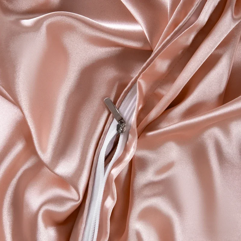
The unique properties of silk—particularly high-quality Mulberry silk in the 19-25 momme weight range—provide an exceptional canvas for color expression. This luxurious fabric has been treasured for centuries not just for its feel, but for its ability to display colors with unmatched depth and vibrancy.
Understanding the principles of matching silk bedding colors will give you the foundation needed to create a cohesive, elegant bedroom that reflects your personal style while maximizing the inherent beauty of silk as a material.
Understanding Silk’s Unique Properties and Color Interaction
Silk possesses a natural luminosity that fundamentally changes how we perceive its colors. This unique characteristic stems from the protein fibers’ triangular prism-like structure, which refracts light rather than simply reflecting it as most fabrics do. The result? Colors on silk appear more multidimensional, with subtle shifts in tone as lighting conditions change throughout the day.
When selecting Mulberry silk sheets, understanding how the fabric’s properties affect color perception becomes essential:
- Light Interaction: Silk’s natural sheen creates a soft, glowing effect that enhances color richness while adding visual depth.
- Color Depth: The same color appears more vibrant and luxurious on silk than on matte fabrics like cotton.
- Momme Weight Impact: Higher momme weights (22-25) create deeper color saturation and more dramatic light play, while lighter weights (19-21) offer a slightly more delicate color appearance with subtle translucence.
- Draping Effects: Silk’s fluid drape creates natural folds that produce shadow and light variations, adding dimension to solid colors.
This light-responsive nature means colors can appear slightly different in natural daylight versus artificial lighting. For instance, a silver-gray silk that appears cool and crisp during daylight hours might take on a warmer, more luminous quality under warm bedroom lighting at night.
The quality of the silk itself significantly impacts color presentation. Premium Mulberry silk in the 19-25 momme range showcases colors with exceptional clarity and depth compared to lower-quality alternatives, where colors may appear flatter or less vibrant.
Color Theory Fundamentals for Bedroom Design
Creating a harmoniously colored bedroom begins with understanding basic color theory principles and how they uniquely apply to silk’s reflective properties. When working with luxury bedding, these fundamentals become your roadmap to creating visually appealing combinations.
The four key color schemes that work exceptionally well with silk bedding include:
Monochromatic Schemes: Using different shades and tints of a single color creates a sophisticated, serene bedroom environment. This approach works particularly well with silk because the fabric’s natural sheen highlights subtle variations within a color family. For example, combining ivory, cream, and champagne silk sheets creates elegant depth without overwhelming visual complexity.
Analogous Schemes: Colors adjacent to each other on the color wheel (like blue and green or rose and peach) create a harmonious, flowing effect. Silk’s luminous quality softens the transitions between these related colors, resulting in a unified look. This approach works beautifully for creating calm, cohesive bedroom environments.
Complementary Schemes: Colors opposite each other on the color wheel (purple and yellow, blue and orange) create dramatic visual interest. With silk, these combinations should be used thoughtfully—perhaps with one color dominant and the complementary shade as an accent—to prevent overwhelming the space.
Triadic Schemes: Three colors equally spaced around the color wheel offer balanced visual stimulation. In silk bedding, this approach works best when one color remains dominant, with the other two serving as accents.
Beyond these schemes, understanding warm versus cool tones significantly impacts bedroom ambiance:
- Warm tones (reds, oranges, yellows, and gold-tinted neutrals) create feelings of intimacy and coziness
- Cool tones (blues, greens, purples, and silver-tinted neutrals) promote tranquility and spaciousness
Neutral colors serve as the foundation of many successful silk bedding schemes. Ivory, taupe, silver gray, and charcoal provide versatile backdrops that showcase silk’s natural beauty while easily adapting to seasonal changes or décor updates. The process of choosing perfect silk bedding colors often begins with selecting the right neutral base before adding accent colors.
Step-by-Step Guide to Coordinating Silk Sheet Colors
Creating a beautifully coordinated bedroom with silk sheets requires a systematic approach. Follow these steps to achieve a cohesive, luxurious look:
Step 1: Assess Your Bedroom’s Existing Elements
Before selecting silk sheet colors, thoroughly evaluate your current bedroom components:
- Wall Colors: Note whether they’re warm (beige, cream, terracotta) or cool (gray, blue, green)
- Furniture Finishes: Identify dominant wood tones or painted furniture colors
- Flooring: Consider carpet, hardwood, or tile colors as part of your overall palette
- Window Treatments: Note the colors and patterns of curtains or blinds
- Existing Textiles: Catalog throw pillows, blankets, and other textiles already present
Assessment Checklist:
– ☐ Take photos of your room in both natural and artificial lighting
– ☐ Identify 2-3 dominant colors already present
– ☐ Determine if your space has primarily warm or cool undertones
– ☐ Note any colors you want to highlight or downplay
Step 2: Select Your Primary Silk Sheet Color
Your foundation color sets the tone for the entire bedding ensemble:
- For smaller rooms: Lighter colors (ivory, pale blue, soft silver) create a sense of spaciousness
- For larger rooms: Deeper colors (charcoal, navy, rich emerald) can add coziness and drama
- For north-facing rooms: Warm tones counterbalance cooler natural light
- For south-facing rooms: Cool tones help balance abundant warm sunlight
Selection Checklist:
– ☐ Consider the room’s size and natural light conditions
– ☐ Choose a color that coordinates with immovable elements (walls, flooring)
– ☐ Select a shade that supports your desired bedroom atmosphere
– ☐ Test swatches in your space at different times of day if possible
Step 3: Add Complementary and Accent Colors
Once your primary color is established, thoughtfully select additional colors:
- Use pillowcases in complementary or analogous colors to add visual interest
- Consider a contrasting fitted sheet with a coordinating flat sheet
- Limit your total color palette to 3-4 colors maximum for a cohesive look
- Use the 60-30-10 rule: 60% primary color, 30% secondary color, 10% accent color
Coordination Checklist:
– ☐ Select 1-2 complementary colors that enhance your primary shade
– ☐ Choose accent colors for decorative pillows or throws
– ☐ Ensure all colors work with your existing bedroom elements
– ☐ Verify colors harmonize under both natural and artificial lighting
Step 4: Layer for Depth and Texture
Create visual richness by thoughtfully layering elements:
- Combine solid silk sheets with subtly patterned silk pillowcases
- Add textural contrast with a cashmere throw or textured duvet cover
- Create visual interest through varying sheens (charmeuse silk versus matte elements)
- Use tone-on-tone layering for sophisticated monochromatic schemes
Layering Checklist:
– ☐ Include at least one textural element to contrast with silk’s smoothness
– ☐ Consider layering different weights of silk for subtle textural variety
– ☐ Incorporate elements with varied light-reflective properties
– ☐ Ensure the overall composition feels balanced rather than chaotic
For additional inspiration, explore successful bedroom color schemes with silk that demonstrate these principles in practice.
Creating Different Moods with Silk Sheet Color Palettes
The colors you select for your silk bedding profoundly influence your bedroom’s atmosphere. Each palette below creates a distinct mood while showcasing silk’s natural luminosity.
Calming & Serene
Create a tranquil retreat with these soothing combinations:
| Primary Color | Secondary Color | Accent |
|---|---|---|
| Powder Blue | Silver Gray | White |
| Sage Green | Ivory | Pale Lavender |
| Lavender | Light Gray | Silver |
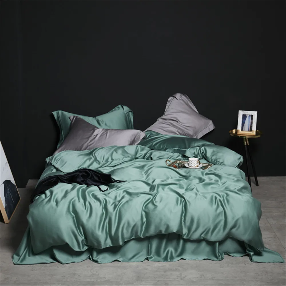
| Sea Foam | Pale Blue | White |
These cooler tones naturally reduce stress and promote relaxation. Green silk sheets are particularly effective for creating a serene environment, as green connects with nature and promotes feelings of balance. These colors appear especially beautiful in natural daylight and create a gentle glow under soft evening lighting.
Romantic & Warm
For an intimate, inviting atmosphere, consider these combinations:
| Primary Color | Secondary Color | Accent |
|---|---|---|
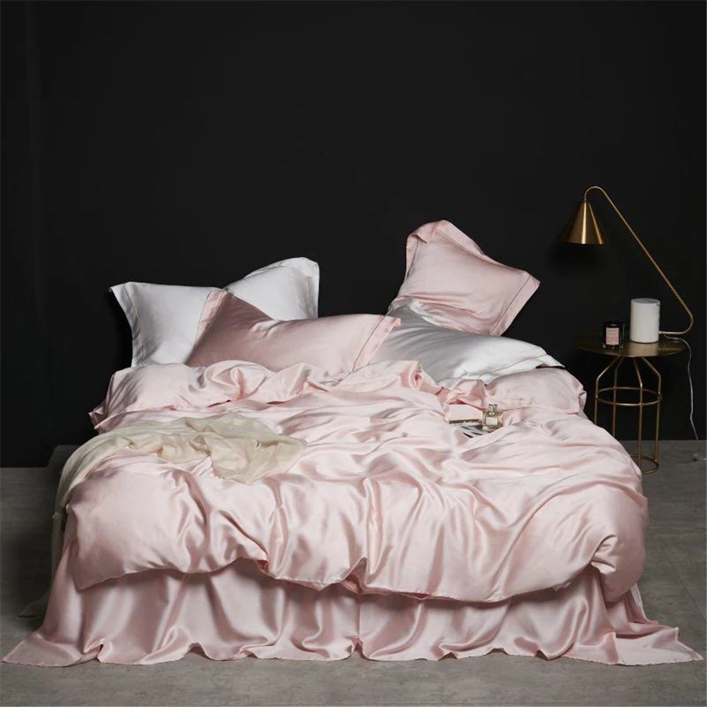
| Blush Pink | Champagne | Ivory |
| Warm Taupe | Rosewood | Cream |
| Champagne | Pale Gold | Warm Gray |
| Soft Peach | Ivory | Rose Gold |
These warm-toned palettes create a cozy, intimate atmosphere perfect for a primary bedroom. The natural sheen of silk enhances these colors’ warmth, creating a subtle glow that feels especially inviting in evening lighting. These combinations work beautifully with warm wood tones and brass or gold accents.
Vibrant & Energetic
For spaces that inspire and energize, consider these more dynamic pairings:
| Primary Color | Secondary Color | Accent |
|---|---|---|
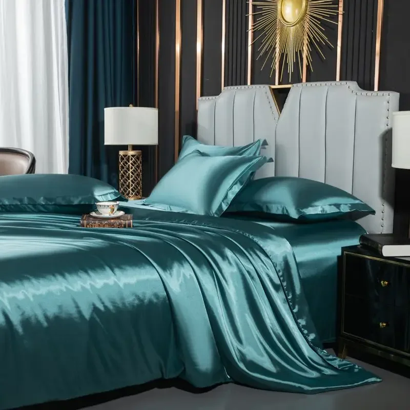
| Teal | Silver | Coral |
| Ruby Red | Ivory | Gold |
| Royal Purple | Silver Gray | Pale Pink |
| Peacock Blue | Champagne | Emerald |
These combinations are best used in rooms with abundant natural light. With silk’s reflective properties, vibrant colors appear particularly rich and dimensional. Balance is crucial—pair one vibrant color with neutrals to prevent visual overwhelm.
Sophisticated & Elegant
For timeless refinement, these combinations offer understated luxury:
| Primary Color | Secondary Color | Accent |
|---|---|---|
| Charcoal | Silver | Pale Blue |
| Navy | Ivory | Gold |
| Deep Purple | Light Gray | Silver |
| Chocolate | Cream | Bronze |
These combinations create a sense of depth and richness, particularly in silk’s lustrous finish. They work exceptionally well in bedrooms with sophisticated furniture pieces and architectural details. Evening lighting enhances the dramatic quality of these deeper tones.
Neutral & Timeless
For enduring versatility, these neutral palettes provide the perfect foundation:
| Primary Color | Secondary Color | Accent |
|---|---|---|
| Ivory | White | Taupe |
| Light Gray | White | Silver |
| Taupe | Cream | Warm Gray |
| Silver Gray | Ivory | Pale Gold |
These neutral combinations showcase silk’s natural beauty while creating a tranquil backdrop that allows other design elements to shine. The subtle variations in tone create visual interest without overwhelming the space. These palettes adapt beautifully to seasonal accessories and changing design preferences.
Expert Tips for Silk Sheet Color Coordination
Elevate your silk bedding coordination with these professional insights that go beyond basic color matching:
Do’s and Don’ts of Silk Color Coordination
Do:
– Limit your palette to 3-4 colors maximum to maintain visual cohesion
– Test colors in both natural daylight and your bedroom’s evening lighting
– Consider the undertones in your silk sheets (warm vs. cool) and match with complementary elements
– Use a single statement color with supporting neutrals for balanced drama
Don’t:
– Overcomplicate with too many bold colors, which can diminish silk’s natural elegance
– Ignore your room’s fixed elements (flooring, architectural features) when selecting colors
– Assume colors will appear identical on silk as they do on other fabrics
– Mix warm and cool undertones without a deliberate bridging element
Room Size and Lighting Considerations
For smaller bedrooms:
– Prioritize lighter colors that reflect more light and create a sense of spaciousness
– Reduce contrast between elements to create visual flow
– Use tone-on-tone combinations rather than stark contrasts
– Consider silk’s sheen as an element that can make a small space feel more open
For larger bedrooms:
– Deeper colors can add coziness to expansive spaces
– Greater contrast between elements helps define different areas
– Layer multiple silk textures for visual richness
– Consider using a more complex color scheme that might overwhelm a smaller space
Mixing Textures and Patterns
- Pair solid silk sheets with subtly textured silk pillowcases for dimensional interest
- Balance silk’s natural sheen with matte elements like a textured throw or duvet cover
- When incorporating patterns, choose designs that include colors from your silk sheets
- Use textural contrast to highlight silk’s natural smoothness (velvet, linen, or cashmere accents)
Seasonal Adaptations
- Transition between seasons by swapping accent pieces rather than all bedding
- Spring/Summer: Lighter, cooler tones and weights
- Fall/Winter: Richer, warmer tones with additional layered elements
- Maintain a neutral silk sheet base that works year-round, changing accessories seasonally
These strategies for coordinating bedding colors for a harmonious sanctuary ensure that your silk sheets always look their best while creating the desired atmosphere in your bedroom.
Solving Common Silk Sheet Color Coordination Challenges
Even with a solid understanding of color theory, specific challenges can arise when coordinating silk sheets. Here are practical solutions to common dilemmas:
Challenge 1: “How do I refresh my bedroom with new silk sheets without changing everything?”
This common concern has straightforward solutions:
- Identify one or two dominant colors in your existing décor to anchor your new silk selection
- Choose silk sheets in a complementary color that enhances rather than competes with existing elements
- Introduce new silk sheets in a neutral tone, then add colorful accent pillows that bridge old and new elements
- Consider the 60-30-10 rule: keep 60% of your current color scheme, adjust 30% with new silk sheets, and refresh 10% with new accent pieces
Example Solution: If your bedroom currently features blue-gray walls and dark wood furniture, ivory or champagne silk sheets would complement these elements while refreshing the space. Add navy or charcoal accent pillows to tie everything together.
Challenge 2: “How do we choose silk colors for a shared bedroom with different preferences?”
Finding middle ground doesn’t require compromising on style:
- Start with neutral silk sheets (ivory, taupe, light gray) that please both parties
- Allow each person to select an accent color for their side’s decorative pillows
- Choose a third bridging color that complements both preferred accent colors
- Focus on a shared mood (relaxing, energizing) rather than specific colors
Example Solution: If one partner loves blue tones while the other prefers warmer colors, silver-gray silk sheets provide a sophisticated neutral base. Add accent pillows in both navy and terracotta, with cream elements that complement both.
Challenge 3: “What silk colors work best with very bold wall colors or wallpaper?”
Making silk bedding harmonize with statement walls requires balance:
- Extract a secondary or tertiary color from your bold wall as your silk sheet color
- Balance intense walls with silk in a complementary neutral that provides visual rest
- Use silk’s natural sheen to soften the impact of very bold surroundings
- Consider tone-matching rather than exact color-matching for more sophisticated coordination
Example Solution: For a bedroom with emerald green accent walls, silver-gray or ivory silk sheets provide elegant contrast while allowing the walls to remain the focal point. Add small touches of emerald in pillowcases or a throw to create cohesion.
Luxury silk bedding sets often include multiple pieces in coordinating colors, offering ready-made solutions for these common challenges. These curated collections take the guesswork out of creating a cohesive look while ensuring all elements work harmoniously together.
When to Break the Rules: Creative Approaches to Silk Color Coordination
While color theory provides valuable guidelines, some of the most striking bedroom designs come from thoughtfully breaking conventional rules. Silk’s inherent luminosity and depth make it particularly suitable for creative color experimentation.
Traditional color wisdom suggests limiting contrasting colors and maintaining strict adherence to color wheel relationships. However, silk’s unique properties allow for more artistic freedom:
- High-Contrast Pairings: Though typically avoided, dramatic contrasts like midnight blue with bright silver can create stunning effects on silk due to its light-reflective properties
- Unexpected Combinations: Colors traditionally considered clashing (like certain purples with greens) can achieve harmonious balance in silk due to its complex light interaction
- Asymmetrical Color Distribution: Rather than following the standard 60-30-10 rule, consider an intentionally unbalanced approach like 80-20 for dramatic impact
- Seasonally “Incorrect” Colors: Deep jewel tones typically associated with winter can create year-round luxury when executed in lightweight summer silk
The key to successfully breaking color rules lies in intentionality. Each departure from convention should serve a specific aesthetic purpose rather than appearing accidental. For example, a single vibrant accent color against otherwise neutral silk creates a focal point that draws the eye exactly where you want it.
Silk’s natural properties also help make unusual combinations work:
– Its light-reflective quality softens stark contrasts
– Its depth and dimension add sophistication to bold color choices
– Its natural sheen creates a unifying element across diverse color selections
For inspiration on creative approaches to styling silk sheets in your bedroom, consider looking beyond traditional interior design to fashion, art, or nature for unexpected color combinations that translate beautifully to silk bedding.

100% Silk Sheets, Green Silk Sheets, King Size Silk Bedding Set, Mulberry Silk Bedding Sets, Queen Size Silk Bedding Set
Price range: $1,246.21 through $1,615.22 Select options This product has multiple variants. The options may be chosen on the product page
Mulberry Silk Fitted Sheet, Mulberry Silk Sheets
Price range: $486.21 through $944.97 Select options This product has multiple variants. The options may be chosen on the product page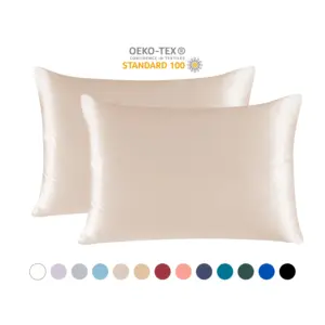
100% Silk Sheets, Mulberry Silk Pillowcases, Mulberry Silk Sheets
Price range: $105.03 through $121.45 Select options This product has multiple variants. The options may be chosen on the product page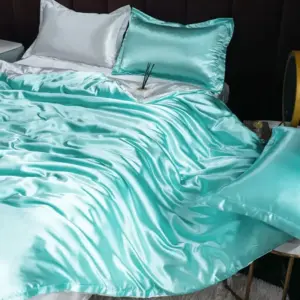
Luxury Silk Bedding Sets, Mulberry Silk Bedding Sets, Silk Sheet and Pillowcase Set
Price range: $61.33 through $159.87 Select options This product has multiple variants. The options may be chosen on the product page
100% Silk Sheets, Luxury Silk Bedding Sets
Price range: $1,151.50 through $1,221.50 Select options This product has multiple variants. The options may be chosen on the product page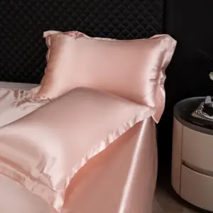
King Size Silk Bedding Set, Mulberry Silk Bedding Sets, Mulberry Silk Sheets, Queen Size Silk Bedding Set, Twin Silk Bedding Set
Price range: $224.62 through $297.27 Select options This product has multiple variants. The options may be chosen on the product page
The Power of Personal Preference in Silk Sheet Selection
While understanding color theory and coordination principles provides valuable guidance, your personal color preferences ultimately matter most in creating a bedroom that feels truly yours. The most technically perfect color scheme will fall flat if it doesn’t resonate with you emotionally.
Color preferences are deeply personal and often linked to meaningful associations or memories. Perhaps a particular shade of blue reminds you of peaceful vacations by the ocean, or a warm gold evokes comfort from childhood. These emotional connections to colors can enhance your sense of well-being and relaxation in your bedroom.
Testing is invaluable when selecting silk sheet colors:
– Request fabric swatches when possible
– Observe potential colors in your bedroom at different times of day
– Consider how colors make you feel, not just how they look
– Trust your instinctive response to colors—it often reveals what will bring you lasting pleasure
Remember that premium Mulberry silk in the appropriate weight range (19-25 momme) will elevate any thoughtfully chosen color scheme. The exceptional quality of the material itself contributes significantly to the overall aesthetic impact.
When making your final selection, keep these key principles in mind:
– Choose colors that make you feel good, not just what’s trending
– Consider how your selected colors will support your sleep and relaxation
– Balance color coordination with personal meaning
– Select shades that complement your skin tone for the most flattering effect
Understanding whether bedding should match wall color can help inform your decision, but there’s no absolute rule. Sometimes contrast creates interest, while other times harmony creates calm. Your bedroom should reflect your personal taste while remaining a sanctuary for rest and rejuvenation.