
Introduction: Beyond the Matching Myth
When decorating a bedroom, one question often creates confusion: should your bedding match your wall color? This seemingly simple question actually opens up a world of design possibilities that go far beyond perfect matching. While many assume that bedroom elements should match perfectly, interior designers know that strict color matching is actually a limiting myth.
The true goal of bedroom design isn’t perfect uniformity but creating harmony and cohesion. Your bedroom should feel intentional and balanced, whether your bedding perfectly matches your walls or creates a beautiful contrast. What matters most is that your color choices reflect your desired aesthetic, support your mood, and align with your personal style preferences.
In this guide, we’ll explore various approaches to bedroom color coordination, from matching strategies to contrasting techniques. We’ll see how design has evolved beyond matchy-matchy trends toward more sophisticated relationships between colors. Understanding matching silk bedding colors provides a foundation for creating a space that feels both cohesive and interesting, without being formulaic.
Remember, the relationship between your bedding and wall color exists on a spectrum of possibilities rather than as a simple yes-or-no decision. Let’s explore how to navigate this spectrum to create your perfect bedroom sanctuary.
When Matching Bedding and Wall Color Works Best
When we talk about “matching” bedding to wall color, we don’t necessarily mean identical shades. Rather, we’re referring to selecting bedding from the same color family as your walls, creating a cohesive visual experience. This approach creates what designers call a “color-drenched” or “cocoon-like” environment that can transform your bedroom into a truly immersive sanctuary.
This matching strategy offers several notable benefits:
- Creates a sense of tranquility and calm through visual continuity
- Enhances the perception of spaciousness in smaller bedrooms
- Provides elegant simplicity that supports minimalist design philosophies
- Establishes a sophisticated foundation that prevents visual clutter
- Promotes better sleep through reduced visual stimulation
The key to successful matching lies in avoiding monotony through variations in texture and subtle shade differences. For example, light blue walls paired with bedding in slightly different blue tones creates depth while maintaining harmony. Different textures—perhaps silk sheets with cotton or velvet accents—add tactile interest even within the same color family.
This approach particularly complements certain bedroom styles, including minimalist, modern, and spa-inspired retreats. How to coordinate silk sheet colors becomes especially important when working with luxury fabrics that catch light differently than standard bedding. The subtle sheen of silk adds natural dimension to even monochromatic rooms.
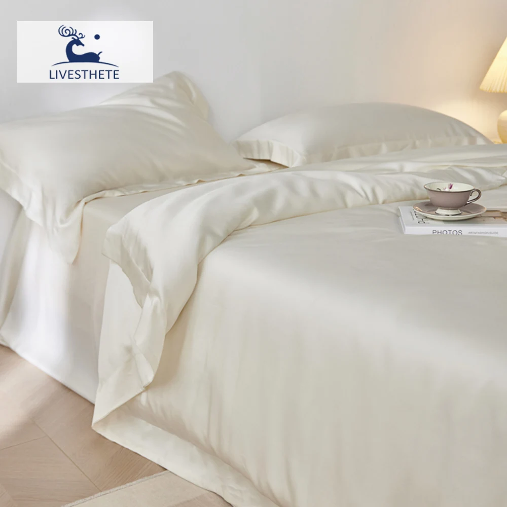
For those seeking a serene, pulled-together look, luxury silk bedding sets in colors that echo your walls can create an elegant retreat that feels both designed and restful.
When Contrasting Bedding and Wall Color Creates Magic
While matching creates harmony, contrast creates energy and visual interest. Contrasting means intentionally selecting bedding in colors that stand apart from your walls, creating a dynamic relationship that draws the eye and adds personality to your bedroom.
Contrast serves several powerful design functions:
- Establishes a clear focal point, typically making the bed the center of attention
- Creates visual hierarchy, helping guide the eye through the space
- Adds energy, character, and dimension to what might otherwise be a flat room
- Expresses personality and design confidence
- Allows for easier updates and changes without repainting
A successful contrasting scheme doesn’t mean clashing colors. Rather, it means thoughtfully selecting colors that relate to each other while maintaining their distinct identities. For example, deep blue walls with golden yellow bedding creates a striking yet sophisticated contrast that feels intentional rather than random.
This approach particularly suits eclectic, bohemian, and contemporary bedroom styles where visual interest and personal expression take precedence over uniform calm. Contrast can be grounded and balanced through neutral elements like white trim, natural wood tones, or cream accents that help mediate between bolder colors.
Understanding how to coordinate bedding colors for a harmonious sanctuary helps ensure that even contrasting schemes maintain an overall sense of balance. The most successful contrasting bedrooms often incorporate elements that subtly reference each other, creating unity amid diversity.
Monochromatic Magic: Playing with Shades and Tints
Monochromatic color schemes offer a sophisticated middle path between exact matching and strong contrast. This approach uses varying shades, tints, and tones from the same color family to create subtle depth and interest while maintaining overall harmony.
In a monochromatic bedroom, your walls and bedding share the same base color but appear in different intensities. This creates a layered, dimensional look that feels cohesive yet visually interesting. The variation comes from using:
- Tints (the base color plus white)
- Shades (the base color plus black)
- Tones (the base color plus gray)
Some particularly effective monochromatic combinations include:
- Light blue walls with navy bedding for a serene, oceanic feeling
- Sage green walls with forest green bedding for a natural, grounded atmosphere
- Soft pink walls with burgundy or mauve bedding for romantic sophistication
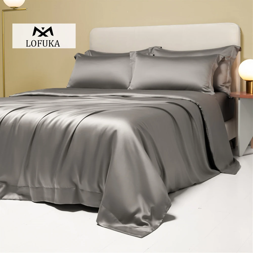
The success of monochromatic schemes heavily depends on texture. Without texture variation, the room can feel flat despite the color shifts. Different fabric finishes—matte, glossy, textured—create visual interest even within a limited color palette. Grey silk sheets work particularly well in monochromatic schemes because their natural luster adds another dimension of visual texture as light changes throughout the day.
Remember that lighting dramatically affects how we perceive different shades of the same color. A monochromatic room will appear to change throughout the day as natural light shifts, creating a subtly dynamic space that still feels restful and cohesive.
Analogous Color Schemes: Natural Harmony with Nearby Hues
Analogous color schemes use colors that sit adjacent to each other on the color wheel, creating relationships that feel naturally harmonious. This approach strikes a perfect balance between matching and contrasting, offering variety without jarring differences.
These combinations feel intuitively pleasing because they echo color relationships we see in nature—think of how sunset colors blend from yellow to orange to red, or how forest colors shift from yellow-green to green to blue-green. When applied to bedroom design, analogous schemes create sophisticated harmony with just enough variation to maintain interest.
Effective analogous combinations for bedding and walls include:
- Blue walls with green or purple bedding
- Yellow walls with orange or green bedding
- Red walls with purple or orange bedding
The key to successful analogous schemes is maintaining a dominant color (often the wall color) while using adjacent colors as accents or supporting elements. This creates a clear hierarchy while maintaining color harmony. When choosing perfect silk bedding colors for analogous schemes, consider how silk’s natural sheen might intensify or soften color relationships.
Analogous schemes work particularly well in bedrooms because they create a sense of flow and continuation that supports relaxation. They’re also forgiving for amateur decorators since these color combinations naturally complement each other with minimal effort.
Complementary Color Pairings: Bold, Strategic Contrasts
Complementary colors sit opposite each other on the color wheel and create the strongest possible contrast while still maintaining harmony. These pairings—blue and orange, purple and yellow, red and green—generate visual energy and vibrance that can make a bedroom feel lively and intentionally designed.
However, complementary color schemes require careful handling in bedrooms. Using complementary colors in equal amounts can create spaces that feel too energetic for restful sleep. Instead, consider these strategic approaches:
- Use the wall color as the dominant color and its complement as an accent in bedding
- Opt for muted or subdued versions of complementary colors rather than their brightest forms
- Balance complementary pairs with neutrals to soften their impact
Some effective complementary combinations include:
- Blue walls with select orange elements in the bedding (pillows, throws)
- Green walls with burgundy accents rather than pure red for a sophisticated take on complementary contrast
- Purple walls with mustard yellow rather than bright yellow for a more restful complementary relationship
These color relationships often carry cultural or psychological associations worth considering. For example, red and green might evoke holiday feelings for some, while blue and orange could feel reminiscent of sports team colors depending on the exact shades.
For those interested in exploring complementary relationships, green silk sheets can create beautiful contrasts with soft purple, pink, or mauve walls while maintaining an elegant, restful atmosphere.
Neutral Bedding: The Versatile Foundation for Any Wall Color
Neutral bedding offers unmatched versatility and enduring appeal regardless of your wall color. Rather than trying to perfectly match or contrast with walls, neutral bedding creates a flexible foundation that adapts to various design choices and simplifies future updates.
The range of neutrals extends far beyond basic white, including:
| Neutral | Undertones | Works Best With |
|---|---|---|
| Pure White | None | Any wall color, particularly bold or dark walls |
| Cream/Ivory | Yellow/warm | Earth tones, warm colors |
| Greige | Gray + beige | Most wall colors; very adaptable |
| Cool Gray | Blue/purple | Blues, purples, cool greens |
| Warm Gray | Yellow/brown | Earth tones, warm colors |
| Taupe | Gray-brown | Both cool and warm colors |
Neutral bedding excels as a canvas for layering. Start with white silk sheets as your base, then add texture and accent colors through pillows, throws, and other accessories that can reference your wall color without directly matching it.
This approach offers practical benefits too. Light neutral bedding makes it easier to spot and address cleanliness issues, and high-quality materials like silk will maintain their beauty regardless of color trends that come and go. While some worry about white or light bedding showing wear, premium materials like those from Sanctuary Soft are designed for durability without sacrificing aesthetic appeal.
Accent Colors: Creating Cohesion Beyond Basic Matching
Accent colors serve as the visual bridges that connect your wall color to your bedding, creating cohesion even when your main colors don’t directly match. These strategic pops of color tie your bedroom elements together while adding personality and depth to the space.
Effective ways to incorporate accent colors include:
- Using throw pillows that contain both your wall color and your main bedding color
- Adding a throw blanket in a color that references your walls
- Including lampshades, artwork, or decorative objects that repeat key colors
- Selecting a patterned rug that incorporates both your wall and bedding colors
The most sophisticated bedrooms often extract accent colors from existing elements in the room. For example, pull a minor color from artwork or a rug to use in bedding accents, creating subtle connections throughout the space. This creates an intuitive sense of harmony even if the main colors differ significantly.
For balanced distribution, follow the 60-30-10 rule: 60% of the room in your dominant color (often walls and larger furniture), 30% in a secondary color (often bedding), and 10% in accent colors (accessories and smaller elements). This proportion creates visual interest while maintaining harmony.
Silk bedding bedroom decor ideas can help you understand how luxury textiles can serve as both main elements and accent pieces in creating a cohesive color story throughout your bedroom.
Pattern Play: Combining Colors Through Textiles
Patterns offer one of the most effective ways to bridge wall colors and bedding, incorporating multiple hues in a harmonious, intentional arrangement. When solid colors feel too limiting or stark, patterns introduce visual interest while creating natural color connections.
To mix patterns successfully in relation to your wall color:
- Vary the scale of patterns (combine large, medium, and small-scale designs)
- Include at least one pattern that contains your wall color
- Maintain a consistent color palette across different patterns
- Mix different pattern types (floral with geometric, stripes with organic shapes)
- Include solid-colored elements to give the eye visual rest
A floral duvet that incorporates both your wall color and your preferred bedding color creates an instant bridge between elements. Geometric patterns can establish structure while organic patterns add movement and softness. Even when using bold patterns, maintaining consistent colors creates cohesion.
Beyond bedding, consider how curtains, rugs, and upholstered furniture can contribute to your pattern story. These elements can reinforce color relationships throughout the room. Exploring silk bedding color options helps you understand how even solid-colored luxury bedding can complement patterned accessories.
Remember that patterns add visual complexity, so they work best in rooms with adequate space and relatively simple furniture. In smaller rooms, limit yourself to fewer patterns at a larger scale to prevent visual clutter.
Room Size and Light: How They Affect Color Choices
Your bedroom’s physical characteristics fundamentally influence how colors appear and interact. Room dimensions and lighting conditions can dramatically transform the same colors, making them appear dramatically different in various settings.
In smaller bedrooms, the relationship between wall color and bedding becomes more intimate and immediate. Consider these adjustments:
- Light-colored walls and bedding create a sense of spaciousness
- Matching wall and bedding colors can blur boundaries, making the room feel larger
- Contrast should be gentler to prevent visual fragmentation of the small space
- Patterns should be scaled appropriately to room size
Light exposure dramatically affects color perception:
- North-facing rooms receive cooler, bluish light that enhances blue and green tones while making warm colors appear duller
- South-facing rooms receive warm, yellow-toned light that enriches warm colors and can wash out cool colors
- East-facing bedrooms receive bright morning light but cooler afternoon light
- West-facing bedrooms receive warm afternoon and evening light but cooler morning light
When selecting wall and bedding colors, always test samples in your actual room at different times of day. A color that looks perfect at noon might appear entirely different by evening when you’re actually using the bedroom.
Mulberry silk sheets have unique light-reflecting properties that interact differently with natural and artificial light compared to cotton or synthetic fabrics. Their natural sheen can enhance colors and add dimension to your bedroom’s color scheme throughout the day.
Creating Your Desired Bedroom Mood Through Color
Beyond aesthetics, your bedroom color scheme profoundly influences mood and sleep quality. The psychological effects of color can either support or hinder your bedroom’s primary functions of rest, relaxation, and rejuvenation.
Different color families create distinct emotional responses:
| Color Family | Psychological Effect | Best Wall-Bedding Combinations |
|---|---|---|
| Blues | Calming, promotes sleep | Blue walls with lighter blue bedding; blue walls with white/cream bedding |
| Greens | Restful, connects to nature | Green walls with neutral bedding; green walls with blue accents |
| Neutrals | Versatile, peaceful | Greige walls with white bedding; taupe walls with ivory bedding |
| Purples | Luxury, creativity | Lavender walls with white bedding; deep purple accent wall with neutral bedding |
| Warm Tones | Cozy, intimate | Terracotta walls with cream bedding; soft pink walls with white or gray bedding |
For restful sleep, consider these color principles:
– Cooler colors generally promote better sleep than warm, energizing colors
– Saturated colors create more stimulation than muted ones
– Personal associations with colors may override general principles
The color temperature of your bedroom also affects perceived physical comfort. Warm colors can make a room feel cozier even at lower temperatures, while cool colors can make a space feel refreshing in warmer climates. Cooling silk sheets paired with cool-toned walls can enhance this refreshing quality in warm environments.

Coordinating with Existing Furniture and Decor
When selecting bedding and wall colors, your existing furniture and decor must be part of the equation. Rather than starting from scratch, successful bedroom design often involves creating harmonious relationships between new color choices and existing elements.
Wood tones particularly influence color compatibility:
– Dark woods (walnut, mahogany) pair beautifully with jewel tones and rich neutrals
– Medium woods (cherry, oak) complement both warm and cool colors
– Light woods (maple, birch) enhance bright, fresh color schemes
Metal finishes also affect color harmony:
– Silver/chrome elements support cool color schemes
– Gold/brass accents enhance warm color palettes
– Bronze/copper finishes bridge warm and cool colors
For different decor styles, consider these approaches:
– Modern: High contrast between walls and bedding with minimal pattern
– Traditional: Coordinated (not matched) colors with classic patterns
– Rustic: Earth tones with natural textures and subtle contrast
– Eclectic: Unified color palette across diverse elements
Transitional pieces like silk pillowcases can introduce luxury and new colors while working with existing bedroom elements. Their versatility makes them excellent “bridge” pieces when you’re not ready for a complete bedding overhaul.
Remember that larger furniture pieces have a significant visual weight. Your bed frame, dressers, and chairs contribute substantially to the overall color impression of your bedroom and should be considered equal players in your color coordination strategy.
Practical Tips: How to Choose Your Perfect Bedroom Colors
Translating color theory into practical choices for your bedroom requires a methodical approach. Follow these actionable steps to select bedding colors that work beautifully with your walls:
- Start with your wall color or the dominant existing color that won’t be changing
- Consider your desired mood and how different color relationships might support it
- Examine the color wheel to identify potential matching, analogous, or complementary relationships
- Gather inspiration from magazines, social media, and design websites
- Collect paint chips and fabric swatches to test in your actual room lighting
- Consider seasonal changes and whether you’ll want different bedding options throughout the year
- Factor in fabric qualities like texture, sheen, and pattern
- Build your bedding in layers, starting with sheets, then adding comforters/duvets, and finally accents
When evaluating colors together, observe them at different times of day under both natural and artificial lighting. What looks perfect in morning light might appear completely different in the evening when you’re actually using the space.
Consider bedroom color schemes for silk specifically if you’re investing in premium bedding. High-quality silk interacts with light differently than cotton or synthetic materials, creating subtle luminosity that enhances your color choices.
For long-term satisfaction, prioritize colors that resonate with you personally over short-lived trends. Quality bedding represents an investment, so choosing colors with enduring appeal makes financial and aesthetic sense.

100% Silk Sheets, Green Silk Sheets, King Size Silk Bedding Set, Mulberry Silk Bedding Sets, Queen Size Silk Bedding Set
Price range: $1,246.21 through $1,615.22 Select options This product has multiple variants. The options may be chosen on the product page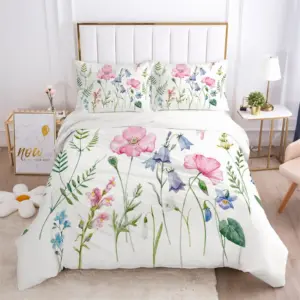
Full Silk Bedding Set, King Size Silk Bedding Set
Price range: $120.99 through $190.49 Select options This product has multiple variants. The options may be chosen on the product page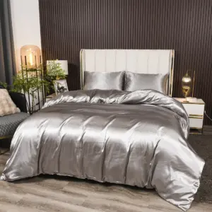
Grey Silk Sheets, Silk Sheet and Pillowcase Set
Price range: $88.20 through $146.64 Select options This product has multiple variants. The options may be chosen on the product page
Bamboo Silk Sheets, Cooling Silk Sheets
Price range: $130.76 through $177.80 Select options This product has multiple variants. The options may be chosen on the product page
100% Silk Sheets, King Size Silk Bedding Set, Mulberry Silk Bedding Sets, Queen Size Silk Bedding Set, White Silk Sheets
Price range: $1,000.79 through $1,351.42 Select options This product has multiple variants. The options may be chosen on the product page
King Size Silk Pillowcases, Mulberry Silk Pillowcases, Queen Size Silk Pillowcases
Price range: $94.96 through $121.56 Select options This product has multiple variants. The options may be chosen on the product page
Common Bedroom Color Coordination Mistakes to Avoid
Even with careful planning, certain pitfalls can undermine your bedroom color scheme. Being aware of these common mistakes helps you create a more successful space:
Creating spaces that are too “matchy-matchy” without texture or variation, resulting in flat, uninspired rooms. Solution: Add textural variety and slight color variations even within matching schemes.
Ignoring lighting conditions when selecting colors, leading to disappointment when colors appear different in actual use. Solution: Always test colors in your specific room under different lighting conditions.
Overlooking undertones in neutrals and existing furniture, creating subtle clashes. Solution: Identify whether colors have warm (yellow, red) or cool (blue, green) undertones and coordinate accordingly.
Following trends without considering personal comfort, resulting in spaces that look current but don’t feel right. Solution: Prioritize colors that help you relax regardless of their trend status.
Using too many competing colors without a clear hierarchy, creating visual chaos. Solution: Follow the 60-30-10 rule for color distribution.
Neglecting the impact of patterns when coordinating colors, leading to busy, unrestful spaces. Solution: Ensure patterns contain colors that connect to your overall scheme.
The best bedroom color schemes feel both intentional and personal. Silk bedding sets offer a luxurious foundation for avoiding these common mistakes, as their natural sheen and fluidity help bridge color relationships while adding sophisticated texture.
Expert Insights: Interior Designers on Bedroom Color Harmony
Professional interior designers consistently emphasize certain principles when approaching bedroom color coordination. Their collective wisdom provides valuable guidance even when working without professional assistance.
Leading designers agree that successful bedroom color schemes typically:
- Prioritize personal comfort and sleep quality over rigid design rules
- Incorporate texture as equally important to color in creating visual interest
- Use neutrals strategically as “palate cleansers” among more distinctive colors
- Limit the total number of colors to create coherence (usually 3-5 maximum)
- Consider the bedroom in the context of adjacent rooms for whole-house flow
Current designer approaches favor:
– Sophisticated color layering rather than stark contrast or perfect matching
– Nature-inspired colors that create calming environments
– Rich, complex neutrals rather than stark whites or beiges
– Intentional color relationships rather than random selection
These professional perspectives align with Sanctuary Soft’s approach to creating premium bedding in thoughtfully selected colors designed to enhance bedroom environments. The natural properties of silk—including its interaction with light and inherent sheen—provide design advantages that synthetic materials cannot replicate.
Frequently Asked Questions About Bedroom Colors
Can I use patterned bedding with colored walls?
Yes, patterned bedding works beautifully with colored walls when the pattern incorporates the wall color or complementary colors. For best results, choose patterns with a clear background color that harmonizes with your walls, and ensure the scale of the pattern suits your room size.
What are the best neutral bedding colors for flexibility?
Pure white, ivory, and soft gray offer maximum flexibility with any wall color. Greige (gray-beige hybrid) is particularly versatile as it works with both warm and cool wall colors. These neutrals allow for easy seasonal changes through accessories.
How many colors should be in a bedroom color scheme?
Most designers recommend limiting a bedroom color scheme to 3-5 colors for visual coherence. This typically includes a dominant color (often the walls), a secondary color (often the bedding), accent colors, and neutrals.
Should bedding match curtains or other textiles?
Bedding doesn’t need to match other textiles exactly, but they should relate harmoniously. Either coordinate them in similar colors or ensure they share at least one common color. Curtains can either blend with walls for a seamless look or coordinate with bedding for definition.
How does ceiling color affect bedding choices?
While most ceilings are white, colored ceilings significantly impact how bedding colors appear. A colored ceiling reflects that tint throughout the room. For colored ceilings, choose bedding that either intentionally contrasts or harmonizes with the ceiling color.
How can I coordinate bedding with an accent wall?
When working with an accent wall, you have two main options: choose bedding that specifically complements the accent wall color (especially if the bed is against this wall) or select bedding that bridges between the accent wall and the other walls. The accent wall color can also be referenced in smaller bedding accents.
What bedding colors work best for small bedrooms?
In small bedrooms, light-colored bedding generally helps the space feel larger and more open. Either match light walls with light bedding for a spacious feel, or create gentle contrast that doesn’t visually fragment the space. Avoid very dark or bold bedding in very small rooms unless you’re specifically seeking a cozy, intimate effect.
Why Premium Silk Bedding Enhances Any Color Scheme
Silk bedding offers unique properties that elevate any bedroom color scheme beyond what standard cotton or synthetic bedding can achieve. The natural characteristics of silk create visual depth and dimension that transform how colors appear in your bedroom.
The distinctive way silk interacts with light—with a natural sheen that subtly shifts as lighting changes—adds a luminous quality to colors that flat-finish fabrics cannot match. This dimension makes silk bedding appear to glow from within, enhancing both matching and contrasting color approaches with sophisticated visual texture.
Silk’s surface quality complements different wall finishes beautifully. Against matte walls, silk provides pleasing textural contrast. Against semi-gloss or eggshell finishes, silk creates a harmonious textural relationship that feels intentionally designed.
Premium silk bedding from Sanctuary Soft, with its 19-25 momme weight range, offers superior drape that creates natural folds and shadows, adding another layer of visual interest to your color scheme. This natural dimensionality makes even monochromatic rooms feel rich and layered rather than flat or bland.
The natural temperature regulation properties of silk also complement different color schemes. Cool colors feel genuinely refreshing when paired with silk’s breathability, while warm colors feel truly cozy thanks to silk’s natural insulating properties. This sensory alignment enhances the psychological impact of your color choices, creating a bedroom that feels as good as it looks.